- Introduction
- First Steps
- UI configuration
Introduction
Pi-Portfolio is a Mango Subsystem that helps system integrators to create customized dashboards without any coding by using the configuration UI pages.
This module also helps users to standardize the data hierarchy to simplify the way the data is filtered and organized. The data will be classified by Site, Device Type, and Device IDs which are the main tags that need to be configured in the data points to allow this module to show accurate data.
Pi-Portfolio UI pages are intended to organize the data in three levels, first level is the Global Overview, which is intended to show high-level information about an entire portfolio of sites that we might monitor in a system like Mango 5. The next level is the Site Overview which is used to show information filtered by site or location, and the third level is the Device Details, which will show data related to a specific device depending on the device type.
Configuring a Mango 5 instance to use Pi-Portfolio can be divided into two main tasks, the first is configuring data points, and the second one is configuring the UI. Both activities can be done in parallel, but both need to be planned to work together.
First Steps
Initial steps to take in order to make sure we are configuring our instance to properly show the data we have is first, to identify if we will have one or multiple sites being monitored in the same instance, and secondly review if the devices we will monitor can be grouped on specific device types.
Once we identify the physical locations were the data is coming from, we should create unique identifiers for each Site, also we might want to add attributes to better filter the sites.
In the same fashion, we need to set unique identifiers for each device we want to monitor, as well of unique identifiers for the device types. That might be the case where the device types can be present on different sites.
The following diagrams and tables show and example of what might be the result of the first step to consider when we start a monitoring project using the EMS.
Sites
For this example we consider that our monitoring system will monitor devices from four (04) different sites, so each site is identified in the following table, as well as three attributes which are Type, Tier and Region.
| Name | XID | Type | Tier | Region |
|---|---|---|---|---|
| Site name 01 | SITE-01 | Type 01 | Tier 2 | North America |
| Site name 02 | SITE-02 | Type 01 | Tier 4 | North America |
| Site name 03 | SITE-03 | Type 02 | N/A | South America |
| Site name 04 | SITE-04 | Type 02 | Tier 3 | South America |
South America
Device Types
For this example we identified there are 5 types of devices we will monitor across all sites, so each device type is identified with a name and XID, and also we added attributes like Category, Make, Model and Firmware.
| Name | XID | Category | Make | Model | Firmware |
|---|---|---|---|---|---|
| UPS GFX-1200 | UPS-GFX-1200 | UPS | Manufacturer 01 | GFX-1200 | 4.5 |
| UPS 3PA-750 | UPS-3PA-750 | UPS | Manufacturer 02 | 3PA-750 | 2.0 |
| HVAC AC 1200VF | HVAC-AC-1200VF | HVAC | Manufacturer 03 | 1200VF | 1.1 |
| HVAC HUM H600VF | HVAC-HUM-H600VF | HVAC | Manufacturer 03 | H600VF | 1.0 |
| GEN S7-1300 T | GEN-S7-1300T | Generators | Manufacturer 04 | S7-1300T | - |
Devices
For this example we identified 29 devices across all sites, so each device is identified with a name, XID, site, device type and an additional attribute which is the serial number.
| Name | XID | Site XID | Device Type XID | Serial Number |
|---|---|---|---|---|
| UPS A | SITE-01_UPS-A | SITE-01 | UPS-GFX-1200 | 4648791369776 |
| UPS B | SITE-01_UPS-B | SITE-01 | UPS-GFX-1200 | 4648791364476 |
| UPS C | SITE-01_UPS-C | SITE-01 | UPS-3PA-750 | 4613497842144 |
| GEN A | SITE-01_GEN-A | SITE-01 | GEN-S7-1300T | S2L5412JU696 |
| AC-01 | SITE-01_AC-01 | SITE-01 | HVAC-AC-1200VF | RR837HF92J12 |
| UPS A | SITE-02_UPS-A | SITE-02 | UPS-GFX-1200 | 46487913697321 |
| UPS B | SITE-02_UPS-B | SITE-02 | UPS-GFX-1200 | 464879136445 |
| UPS C | SITE-02_UPS-C | SITE-02 | UPS-3PA-750 | 461349784216H |
| UPS D | SITE-02_UPS-D | SITE-02 | UPS-3PA-750 | 4613497842131 |
| GEN A | SITE-02_GEN-A | SITE-02 | GEN-S7-1300T | S2L5412JU69D1 |
| GEN B | SITE-02_GEN-B | SITE-02 | GEN-S7-1300T | S2L5412JU696V |
| AC-01 | SITE-02_AC-01 | SITE-02 | HVAC-AC-1200VF | RR837HF92JDD |
| AC-02 | SITE-02_AC-02 | SITE-02 | HVAC-AC-1200VF | RR837HF92JWS |
| HUM-01 | SITE-02_HUM-01 | SITE-02 | HVAC-HUM-H600VF | HUMD65974113 |
| HUM-02 | SITE-02_HUM-02 | SITE-02 | HVAC-HUM-H600VF | HUMD65974113 |
| GEN A | SITE-03_GEN-A | SITE-03 | GEN-S7-1300T | S2L5412JU69D1 |
| GEN B | SITE-03_GEN-B | SITE-03 | GEN-S7-1300T | S2L5412JU69D1 |
| GEN C | SITE-03_GEN-C | SITE-03 | GEN-S7-1300T | S2L5412JU69D1 |
| GEN D | SITE-03_GEN-D | SITE-03 | GEN-S7-1300T | S2L5412JU69D1 |
| GEN E | SITE-03_GEN-E | SITE-03 | GEN-S7-1300T | S2L5412JU69D1 |
| GEN F | SITE-03_GEN-F | SITE-03 | GEN-S7-1300T | S2L5412JU69D1 |
| GEN G | SITE-03_GEN-G | SITE-03 | GEN-S7-1300T | S2L5412JU69D1 |
| UPS A | SITE-04_UPS-A | SITE-04 | UPS-GFX-1200 | 4648791369776 |
| UPS B | SITE-04_UPS-B | SITE-04 | UPS-GFX-1200 | 4648791364476 |
| GEN A | SITE-04_GEN-A | SITE-04 | GEN-S7-1300T | S2L5412JU696 |
| GEN B | SITE-04_GEN-B | SITE-04 | GEN-S7-1300T | S2L5412JU696 |
| AC-01 | SITE-04_AC-01 | SITE-04 | HVAC-AC-1200VF | RR837HF92J12 |
| AC-02 | SITE-04_AC-02 | SITE-04 | HVAC-AC-1200VF | RR837HF92J12 |
| HUM-01 | SITE-04_HUM-01 | SITE-04 | HVAC-HUM-H600VF | HUMD65974113 |
UI configuration
Configuring the UI using the Pi-Portfolio can be done with the pages that are accessible via the “Configuration” Menu Item.
Global Configuration
This page allows the user to configure general elements of the UI, the options we have to configure in this page are:
-
General Overview
-
Alarms
-
Map
-
Sites
-
Device types
-
Devices
Each of them are described below
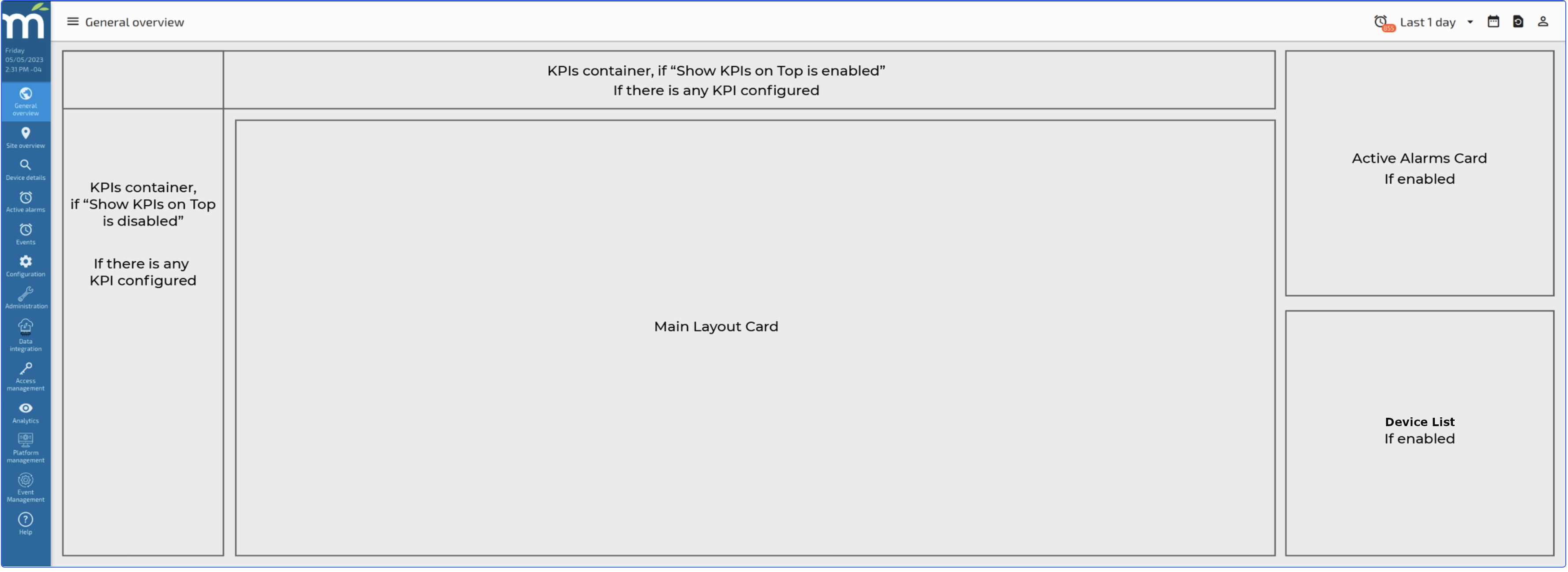
General Overview
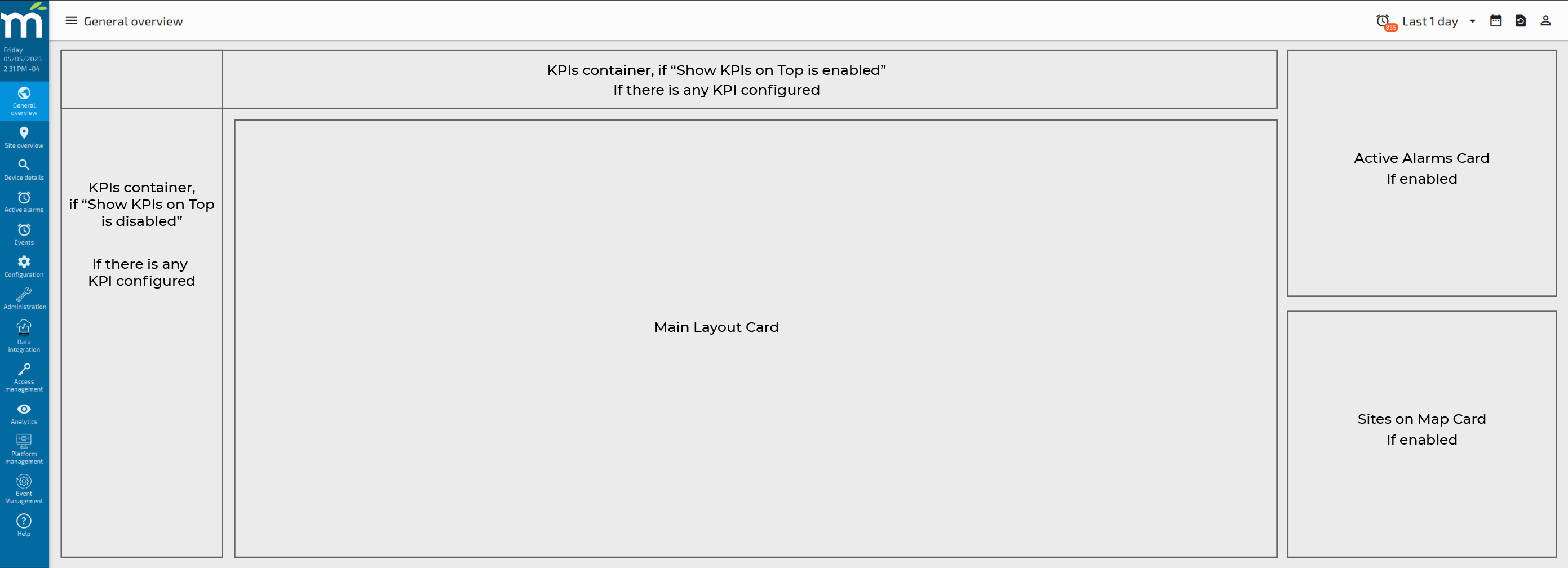
The general overview configuration page include three individual tabs which help the user to customize the Layout of the “General Overview” page, the following image shows how the Layout for the General Overview page can be configured using the options we have in this page.
General Overview Tab
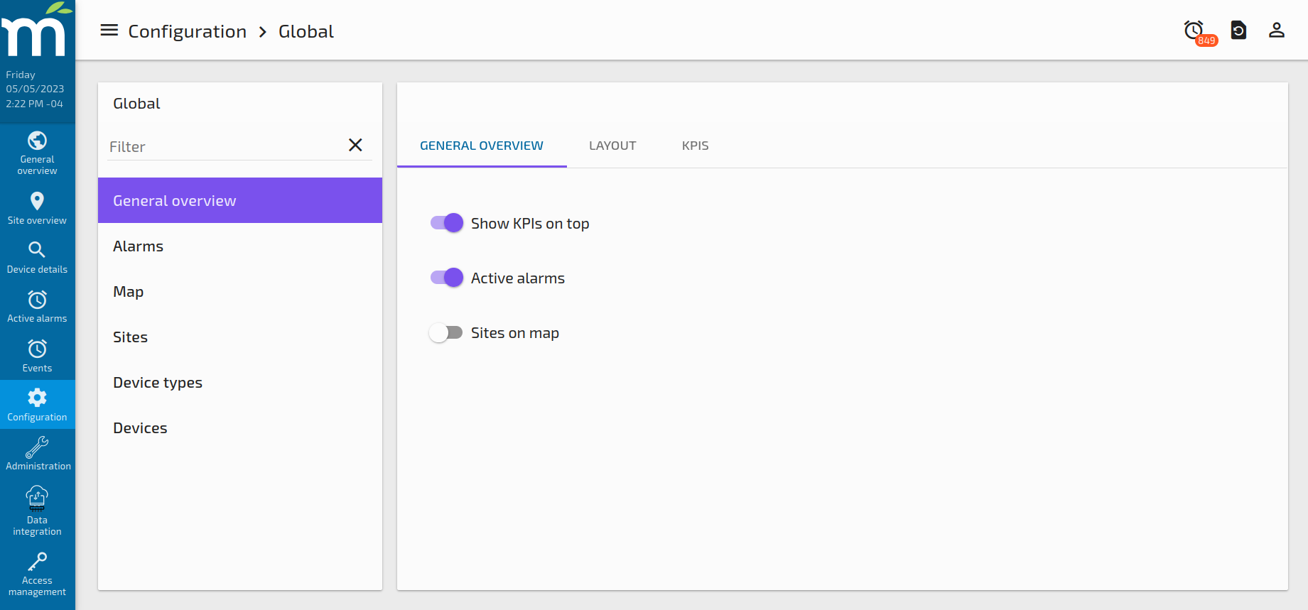
In this tab, we can enable the display of the Global KPIs on a vertical or horizontal way, the option “Show KPIs on Top” is enabled, the Global KPIs will be displayed in the General Overview Page on the top of the page, one besides the other.
If the Active Alarms option is enabled, a card with ALL Active Alarms in the system will appear in the right side of the Global Overview Page.
If the Sites on map option is enabled, a card with a list of sites will appear on the right side of the Global Overview Page, just below the Active Alarms card if it is enabled.
If there are no KPIs configured and the Active Alarms and Site on map options are disabled, the Main Layout Card will use the entire page space. In this way, the user can configure the general layout of this page as it wants.
Layout Tab
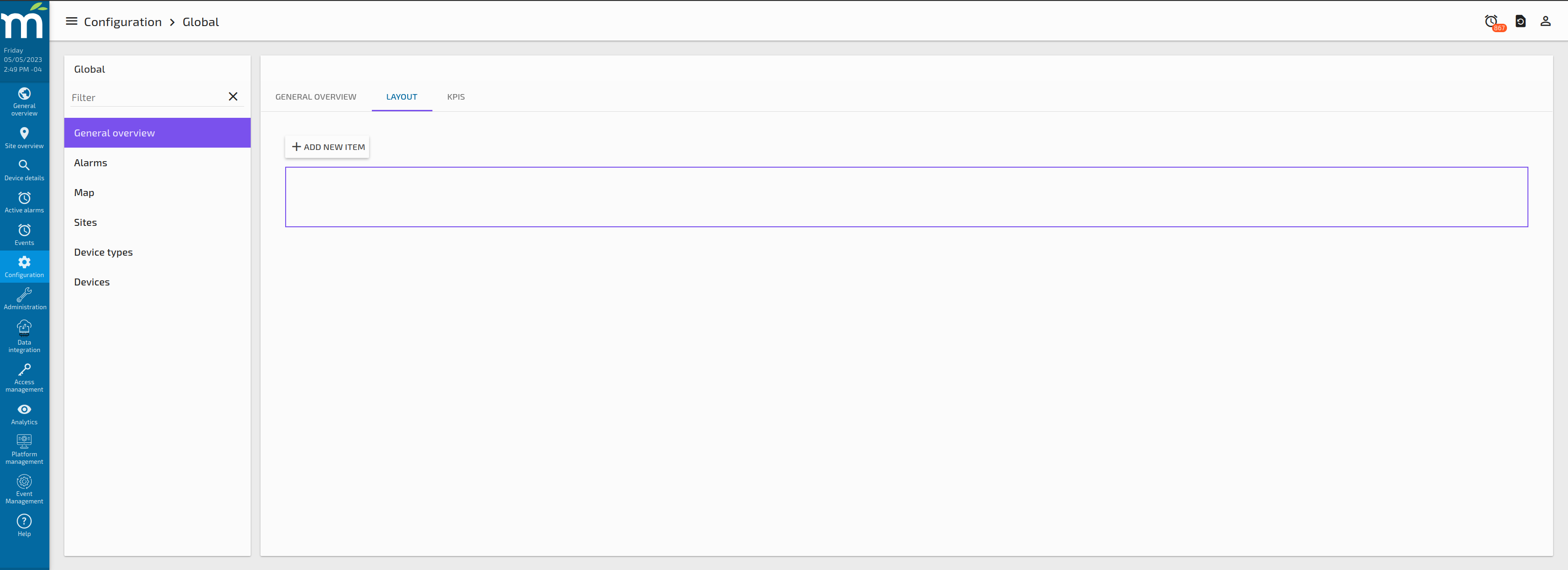
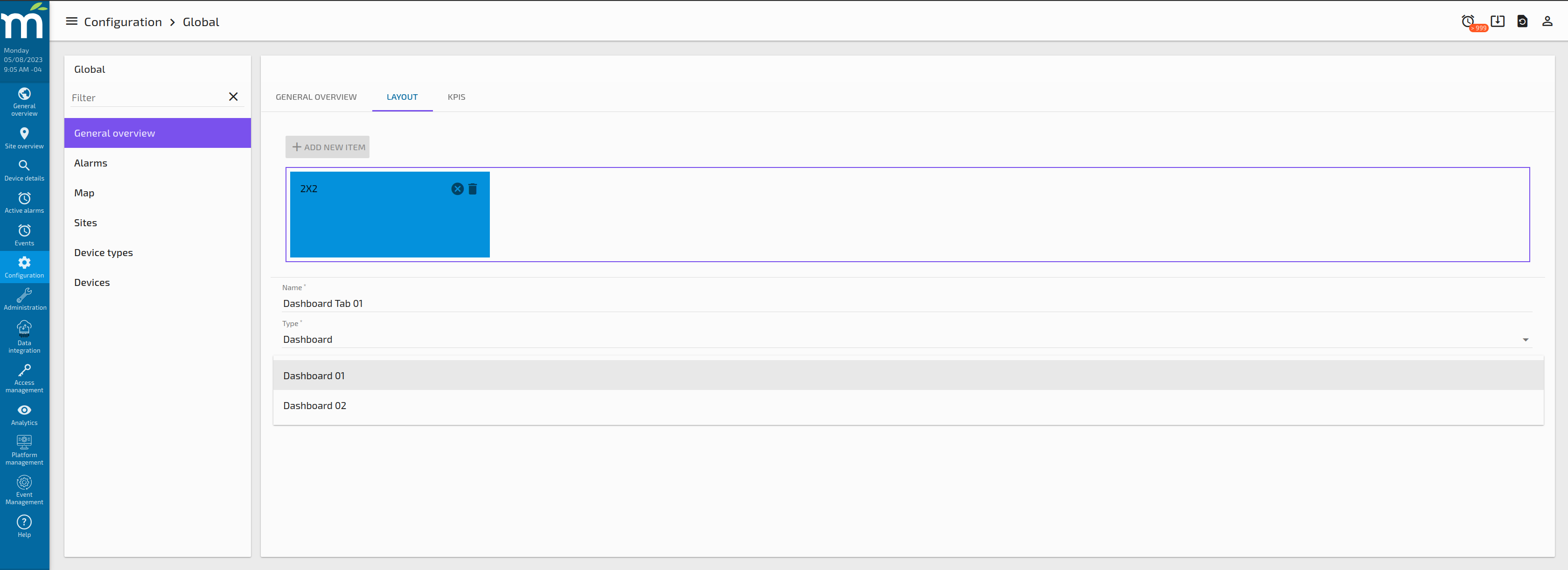
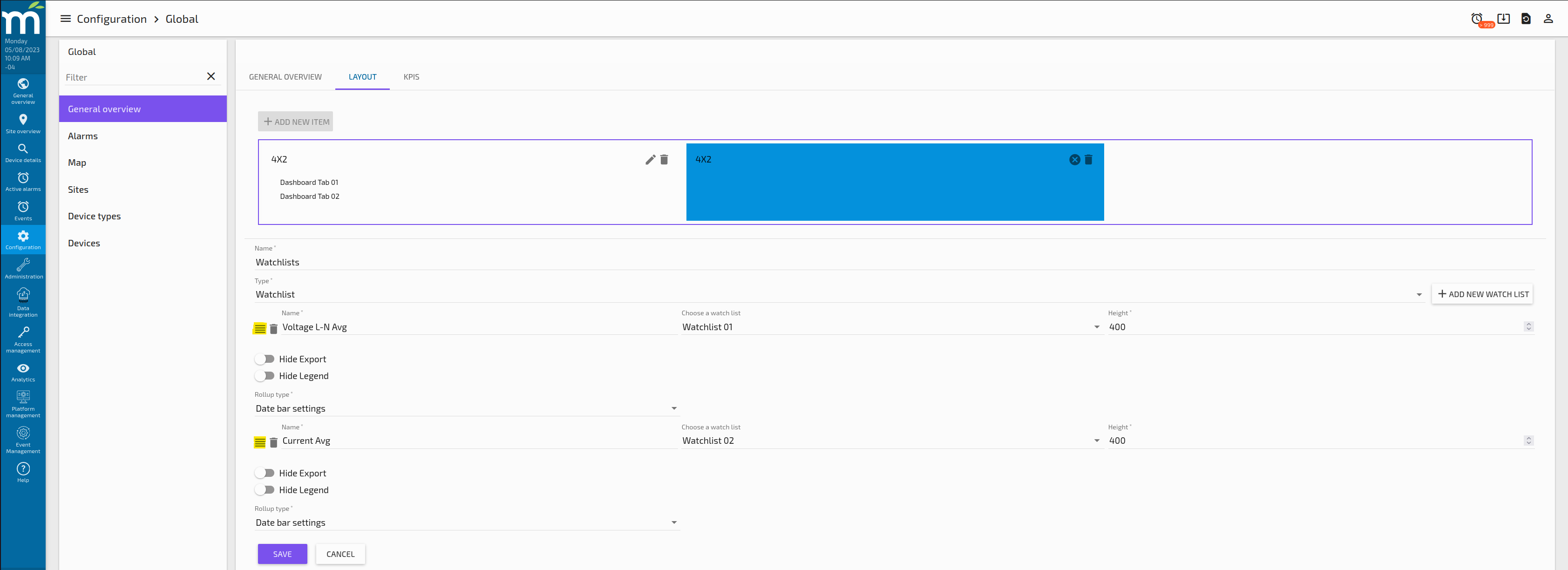
In this tab, we can create a custom layout for the Main Layout Card in the General Overview page, by clicking on the button “ADD NEW ITEM”, a new draggable card will appear in the frame.
So multiple cards can be configured within the frame, so in this way we can create custom layouts for the General Overview Page Main Card.
Each card in this layout, might contain one of many elements within, those elements will be organized as Tabs on each card. So at the end, we can have multiple cards with multiple tabs within each card.
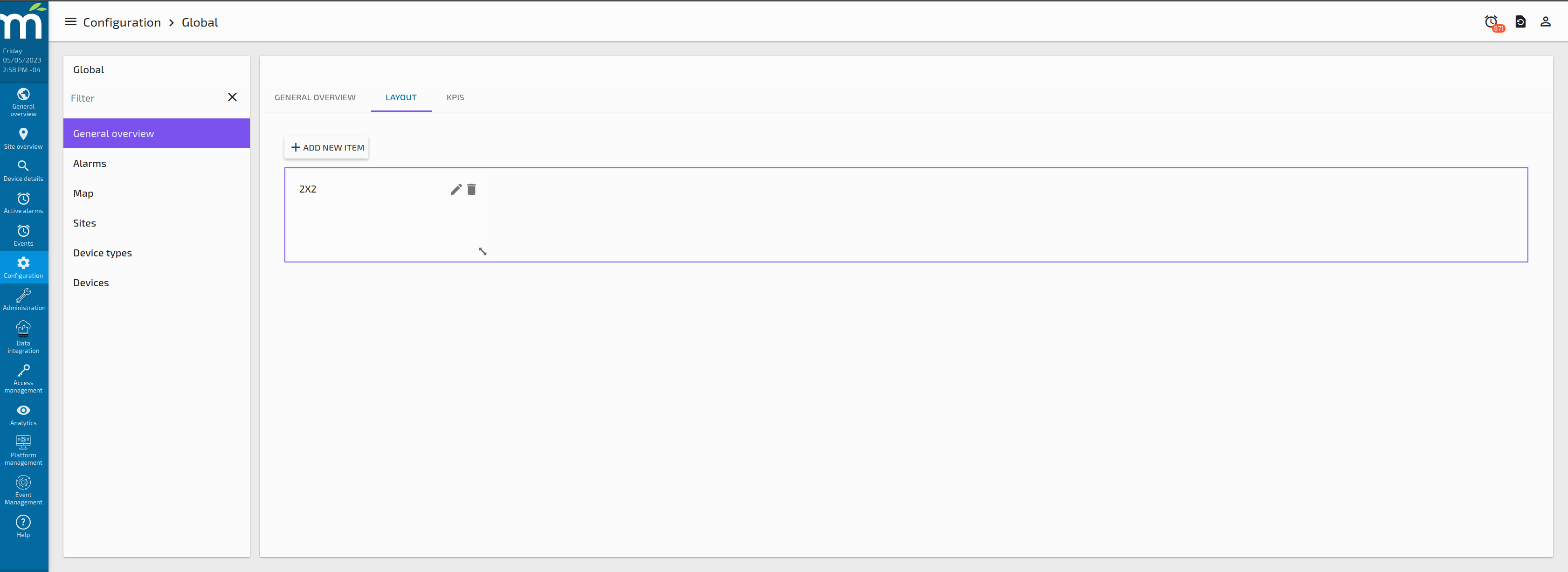
Adding items for a Card in the Main Layout Card
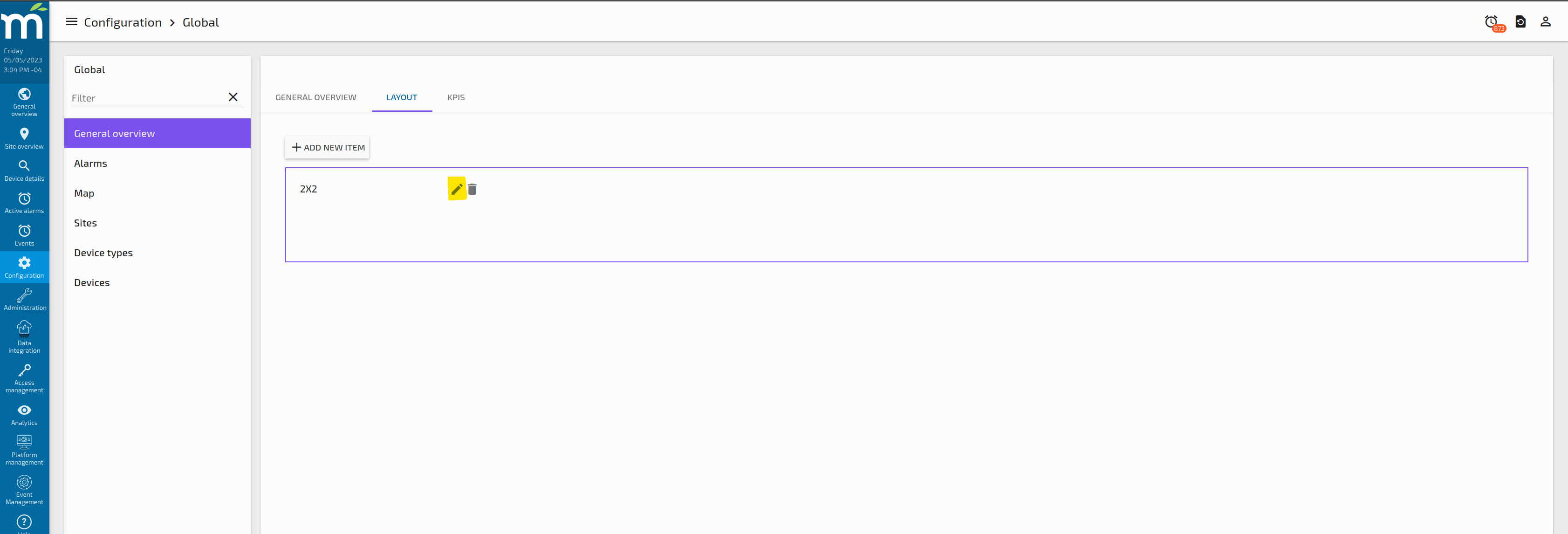
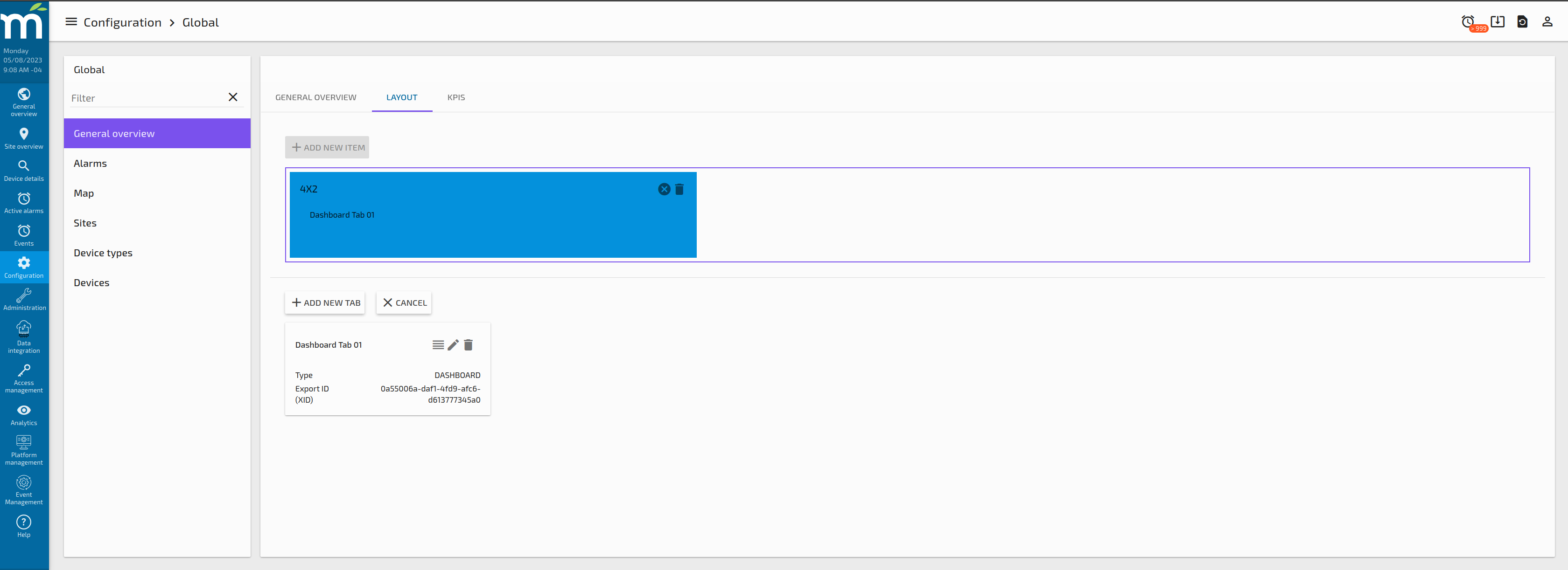
Clicking on the edit button highlighted in the previous image will show a button to “ADD NEW TAB” at the bottom of purple frame, as shown in the following image.

When the “ADD NEW TAB” is clicked, a form to add the new tab will appear, asking to enter the Tab Name and select which type of Tab you want to add.
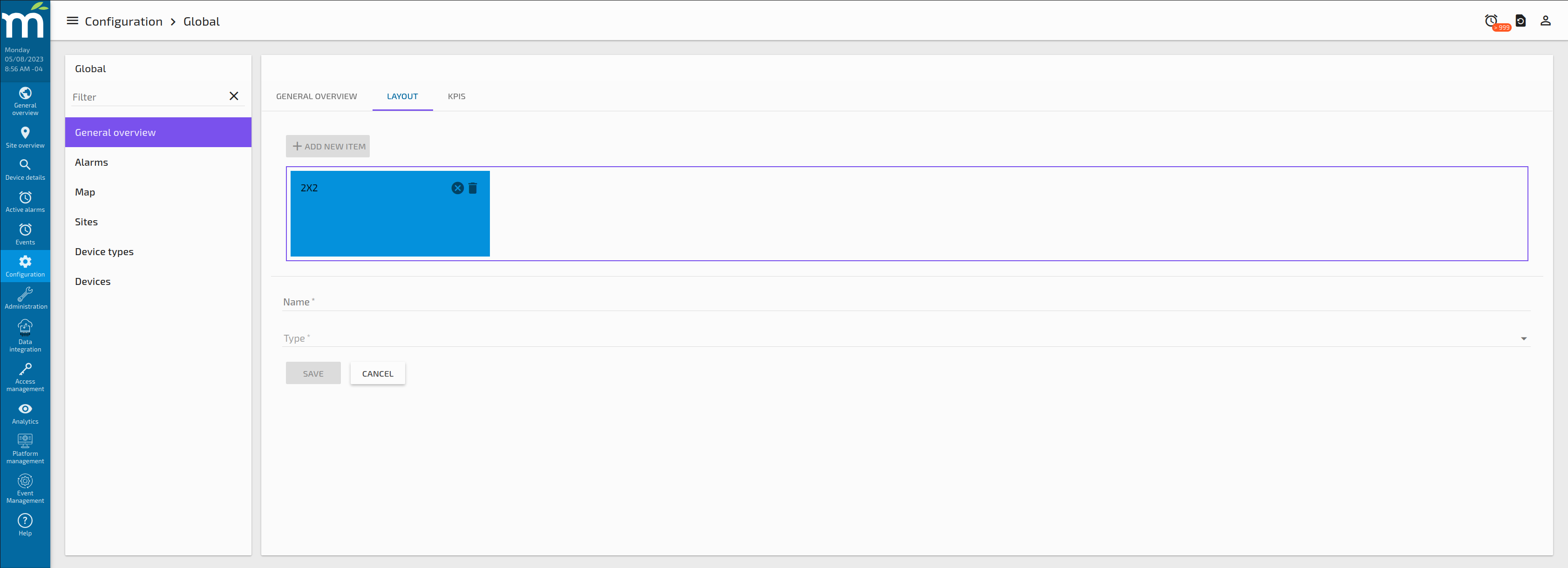
For the Tab types, we have the following:
Tab Type: Dashboard
This tab type allows the user to display an existing Dashboard Designer Page that needs to be already created. So, if this type is selected, a new dropdown will appear with the existing Dashboard Designer Pages that were previously created, like the following images.

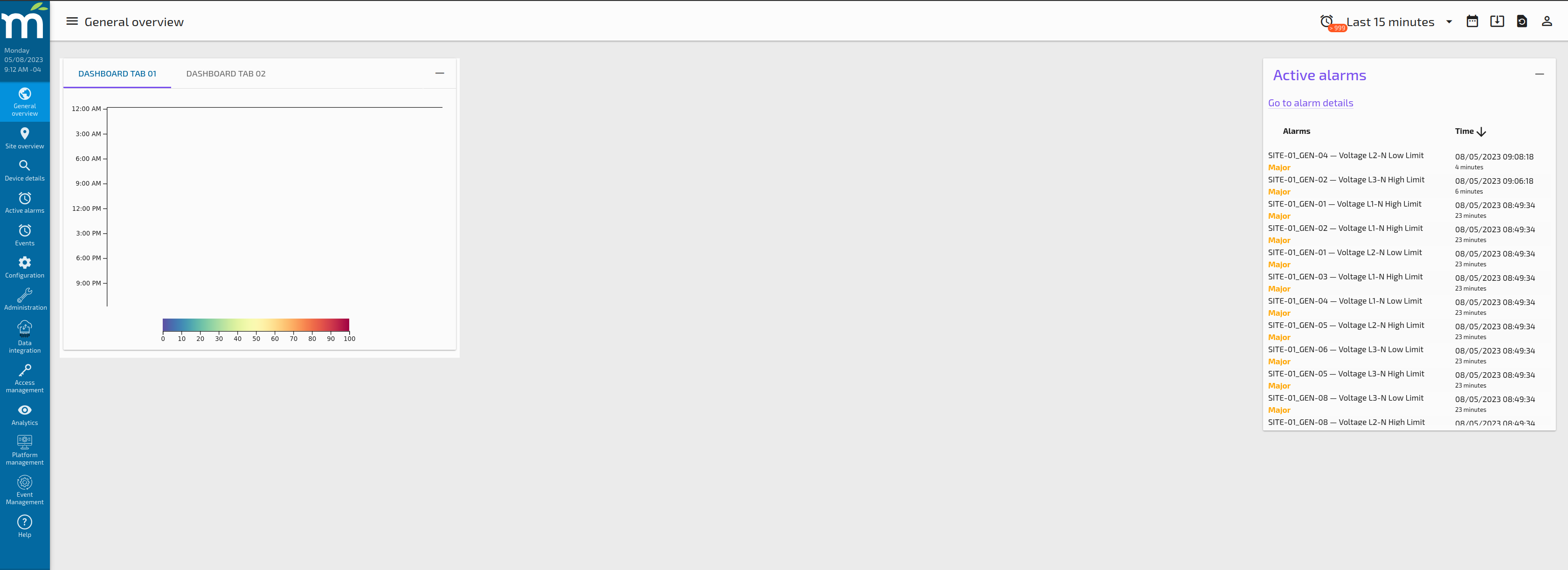
By clicking save in this page, a new Tab will be displayed for this Card as the following image shows. We will have the ability to add multiple Tabs in the same Card.
After adding a second tab in this Card, the result in the General Overview Page will be like the following image.
Tab Type: Watchlists
This tab type allow the user to display one of multiple Watchlists in the same card. When the type Watchlist is selected, a new button “ADD NEW WATCHLIST” appear, so by clicking this button a prompt to add a new watchlist with several options shall appear, as the following screenshot.
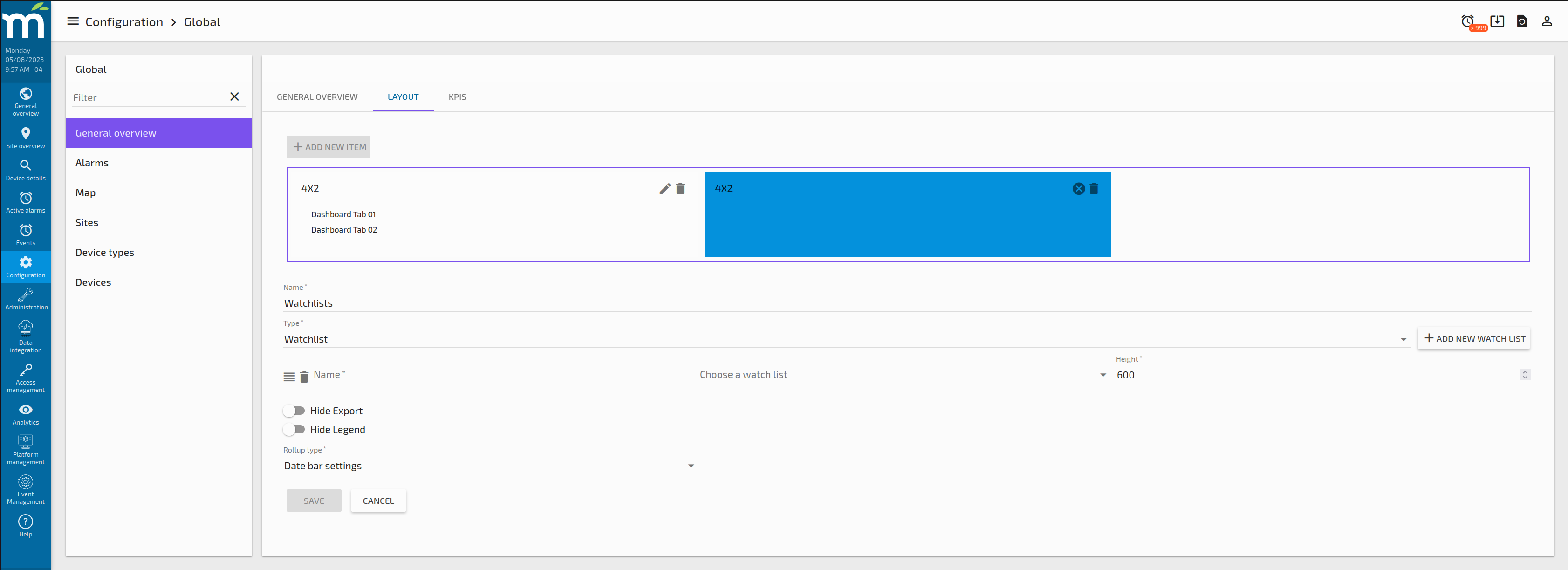
For each Watchlist we need to add a Name, which will be a display name. Then there is dropdown to select a watchlist that should be created previously. The Height of the Watchlist can be set so we can control the card height. Also there are options to “Hide Export” which will disable the option to export the chart in any way, same situation about the legend, that can be disabled with the “Hide Legend” toggle button. Finally, the Rollup Type can be selected if we want to have one different than the Date Bar Settings.
Multiple Watchlists can be added if you click on the “ADD NEW WATCHLIST” button again, same options will be prompted for the new Watchlist. The order of those watchlists can be change by dragging them from top to bottom using the drag button highlighted in yellow in the following screenshot.
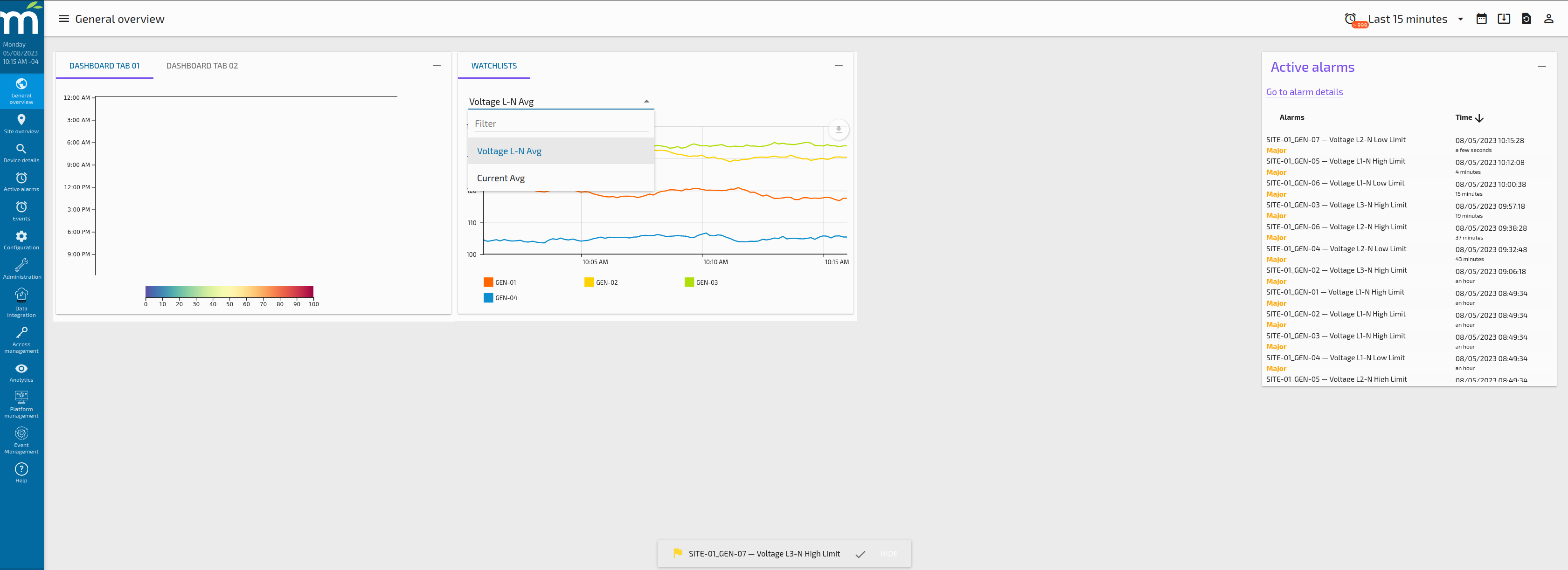
At the end, when we review the changes in the General Overview Page, a new card will appear with a dropdown of watchlists to show like is shown in the following picture.
Tab Type: Active Summary
This tab type allow the user to display a standard Pie Chart with the active alarms counts. These alarms count in this component are global, which mean those are not filtered by Site, Device Type or Device ID.
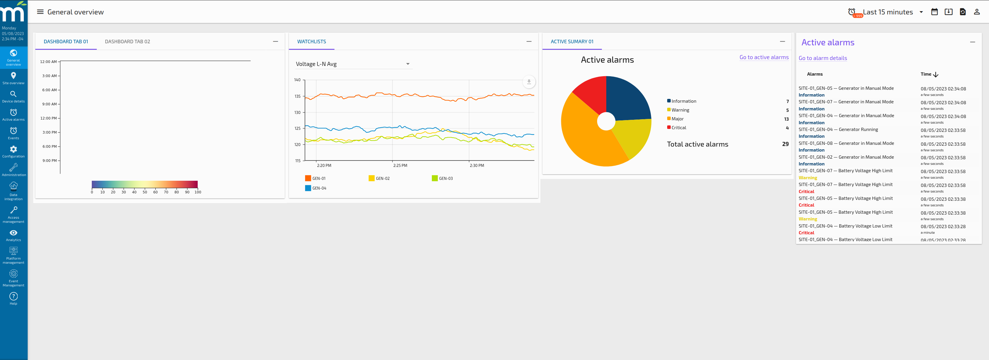
When the user select the Tab Type as “Active Summary”, no other fields need to be filled. After Saving, the card where we added the Active Summary looks like the following screenshot.
Tab Type: Component
As Mango 5 UI is based on AngularJS, a component can be used to display custom content in a tab, for example an animated SVGs for a Heat Map over a 3D model.
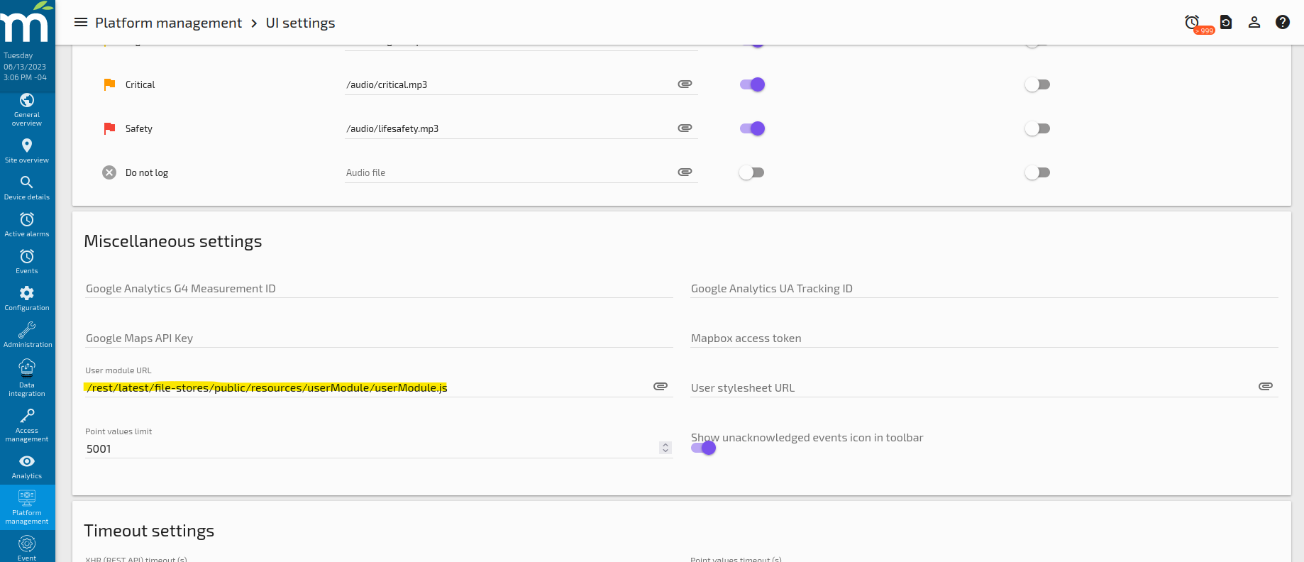
To use this Tab Type, an Angular User Module need to be defined in a Javascript file in the File Store, and also configure the UI Settings to use that module as the User Module, like the following image.
The content of this userModule.js file for this example is the following:
define(
(require) => angular.module('usermodule', ['maUiApp'])
.directive('svgStyle', require('./directives/svgStyle.js'))
.component('view', require('./components/view.js'))
);
Where the “view” component will appear listed in the “Link to custom page” selector when the Component Tab Type is selected, like the following image.
Multiple components can be defined in the User Module to be used in this Tab Type. Also, with the idea of creating generic components that can be used multiple times, input parameters can be injected into the component using JSON syntax that can help the user to optimize and standardize how the content and behavior is managed for each individual tab. The input parameters can be injected using the code editor that appear under the “Link to custom page”.
Tab Type: Site Table
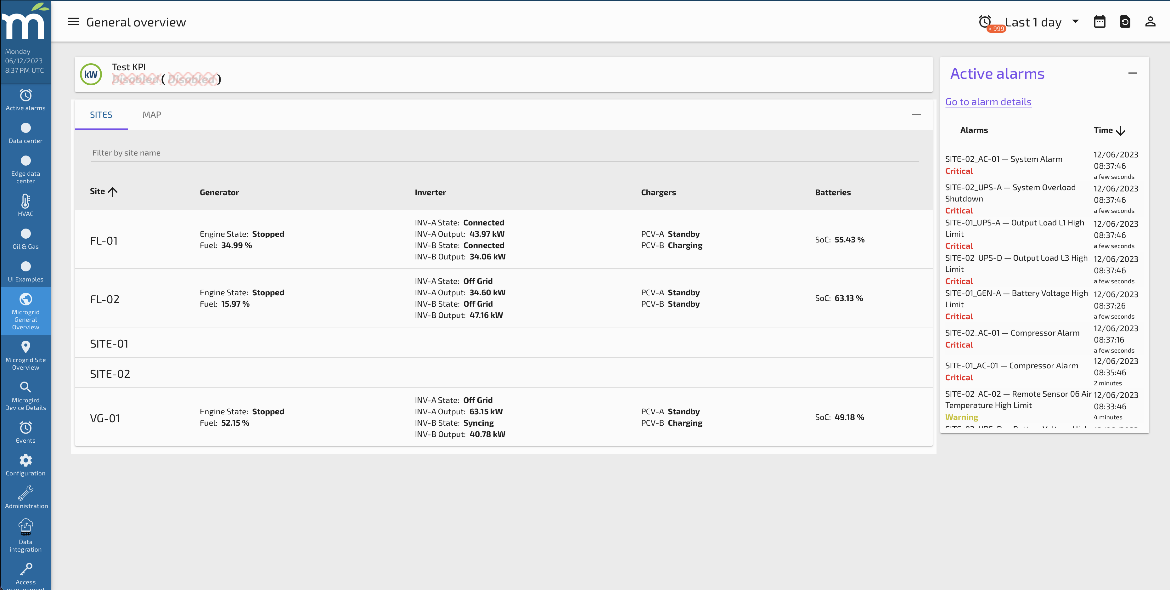
This tab type allows the user to display the list of sites configured in Pi-Portfolio as well as the columns that are defines in the Global Configuration page for the “Sites Columns”. The idea of this component is to show summarized information about the Sites that are being monitored in the Mango instance.
The user can personalize which data points will appear on each column per site, so each site can show different data points on each column. This configuration can be done in the Site Configuration page.
Selecting the Tab Type = Site Table will not require any other input to be configured, just like the next image shows.
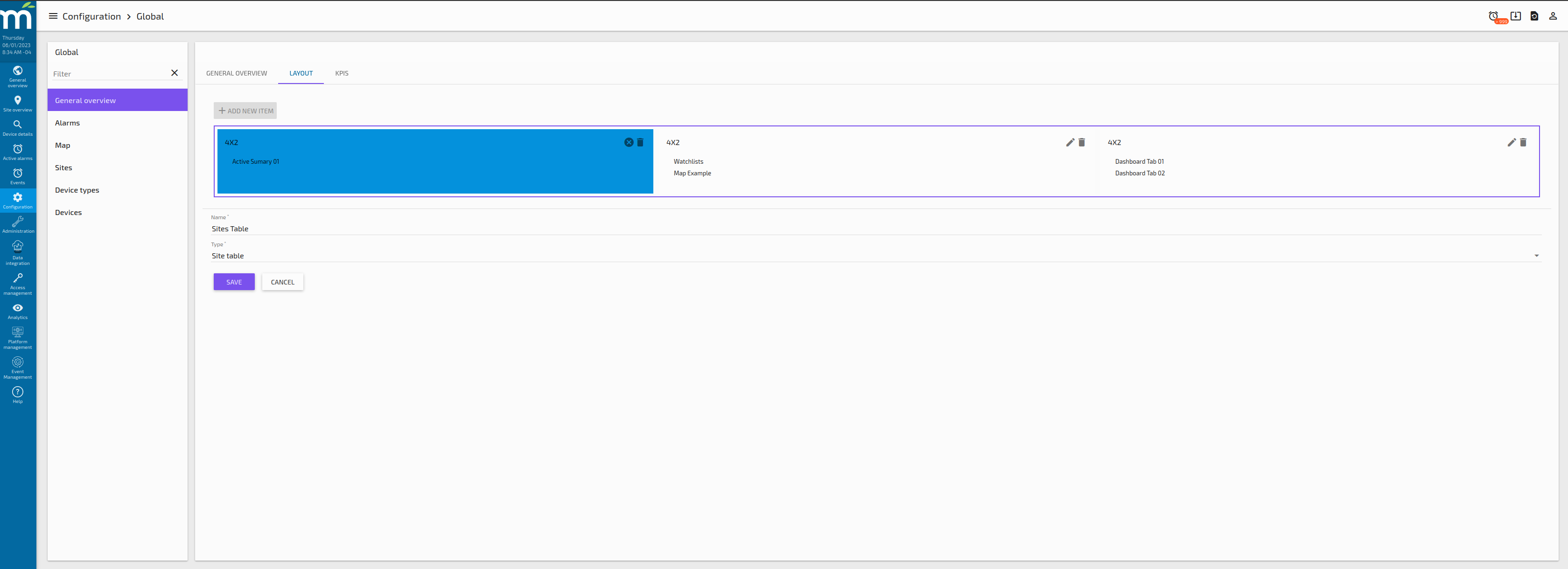
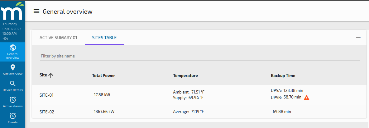
Once this is saved, in the Global Overview page may will look like the following image, where each site shows different data on the same column.
KPIs Tab
The KPIs screen allows the user to include KPIs on the General Overview screen. The user can choose 2 points to be displayed (must have the tag, deviceType=SITE), and how those points might be rolled up should that be desired.
Here is an example of configuring a KPI.
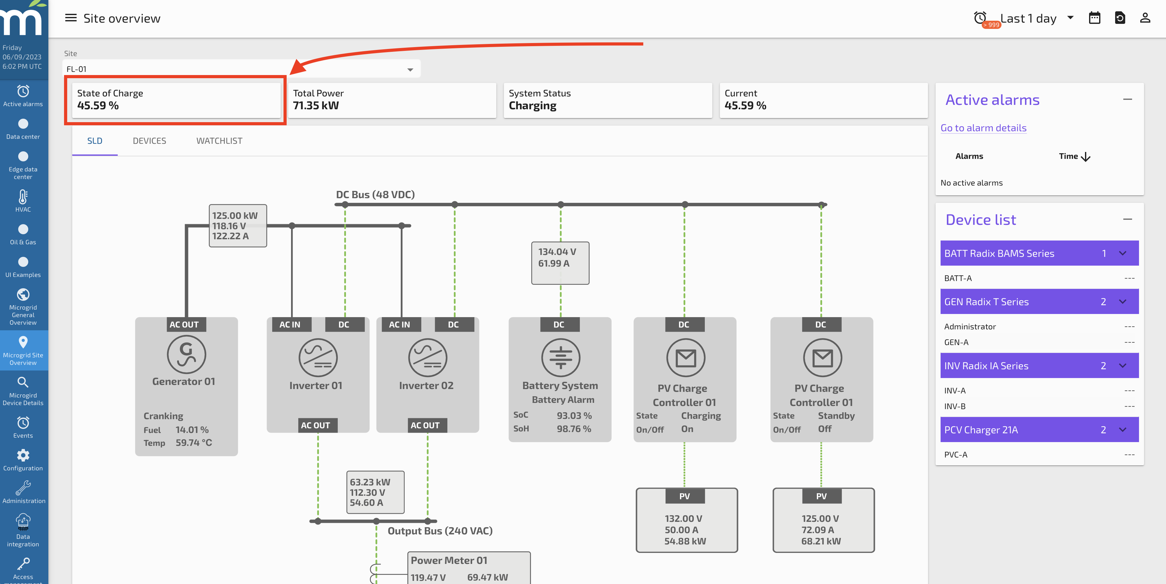
And here is how that KPI appears on the Site Overview screen.
Alarms
The alarms screen allows the user to define the alarms levels desired in the system. Based on the given alarms levels embedded in Mango events, a custom name, color, and icon can be defined here.
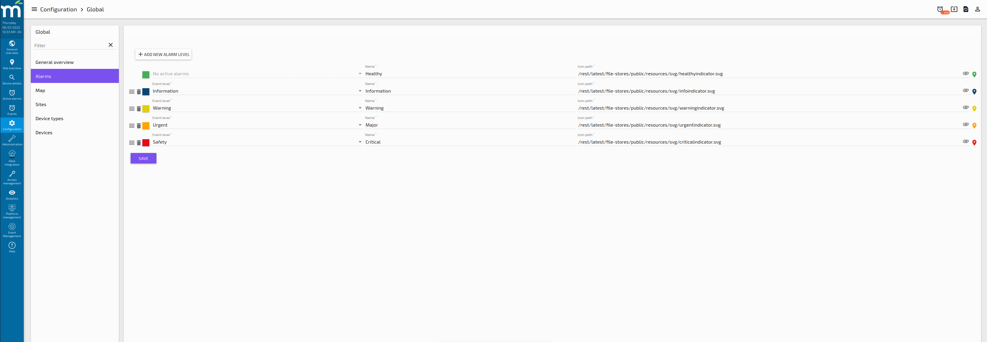
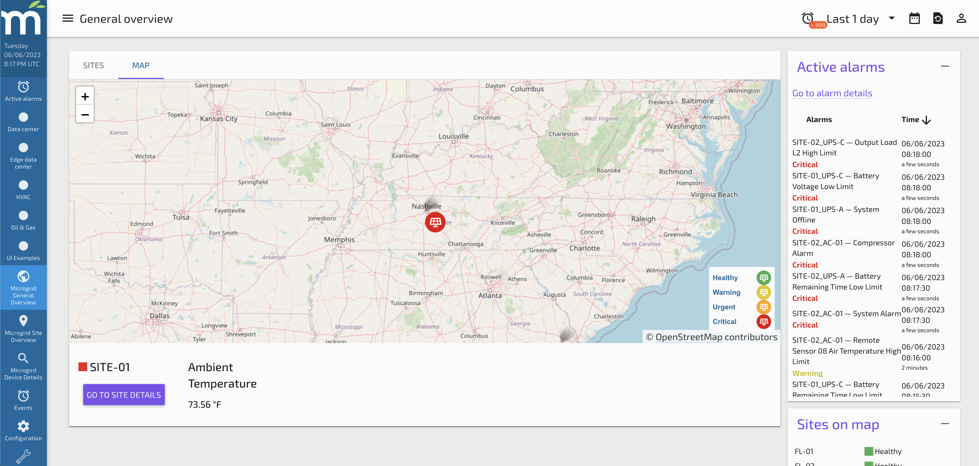
The icons defined for each alarm levels are those that will appear on a map component, like the next image.
Map
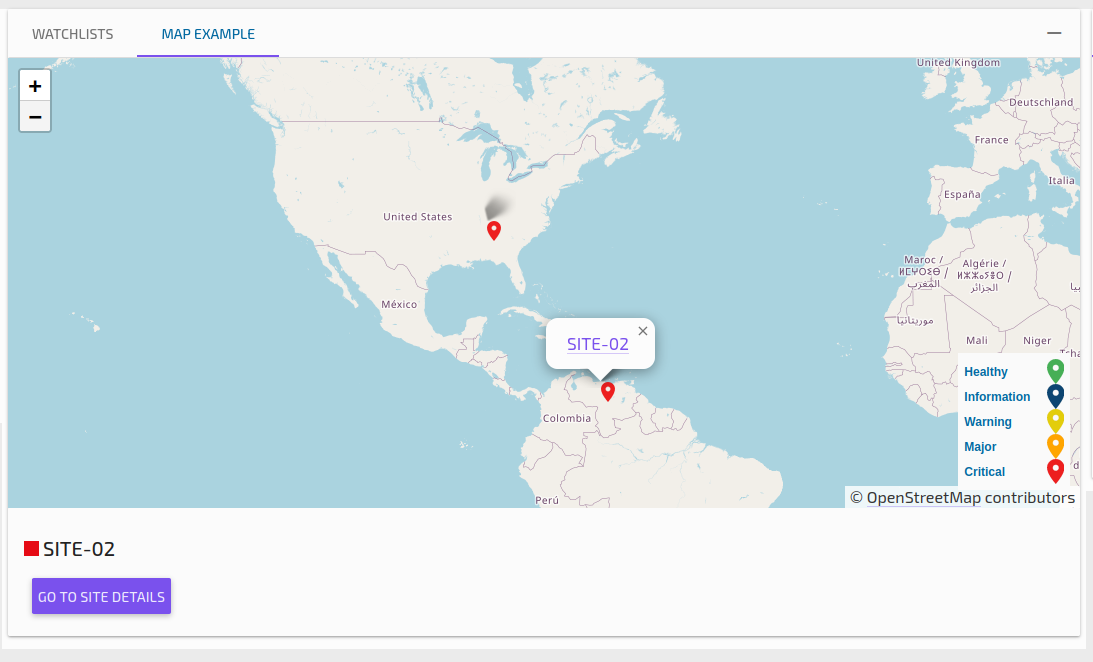
The Map screen allows the user to define the default center point and zoom of any map component dropped into Pi-Portfolio. In addition, we can add multiple data points to be associated with the Map. Data points can be added as well, so that when a user selects a site on the map, the value of that data point will be displayed at the bottom of the map. Multiple points can be chosen. When adding Data points from any data source, it is the Data point Name that must be used.
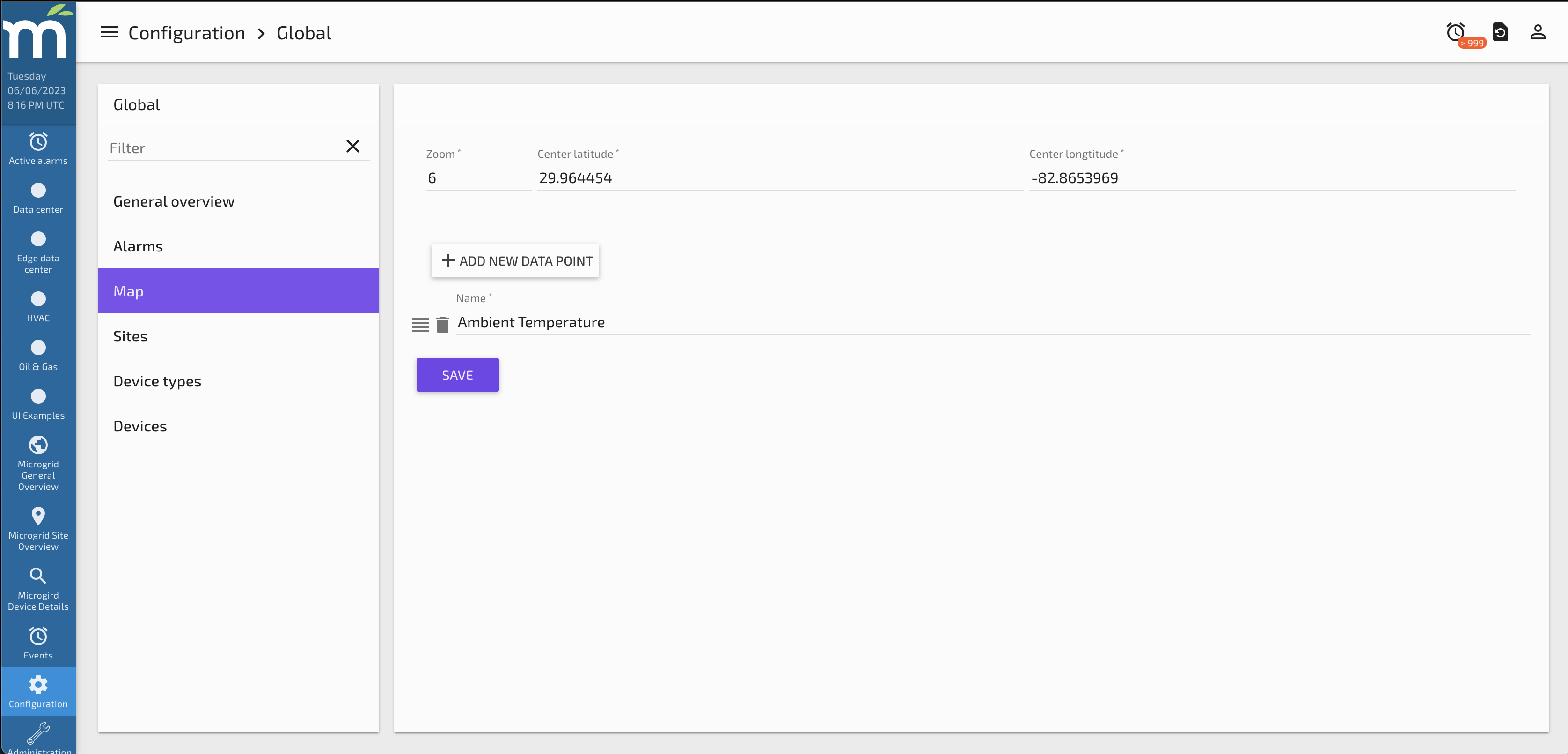
Here is how this configuration will look on the Map screen.
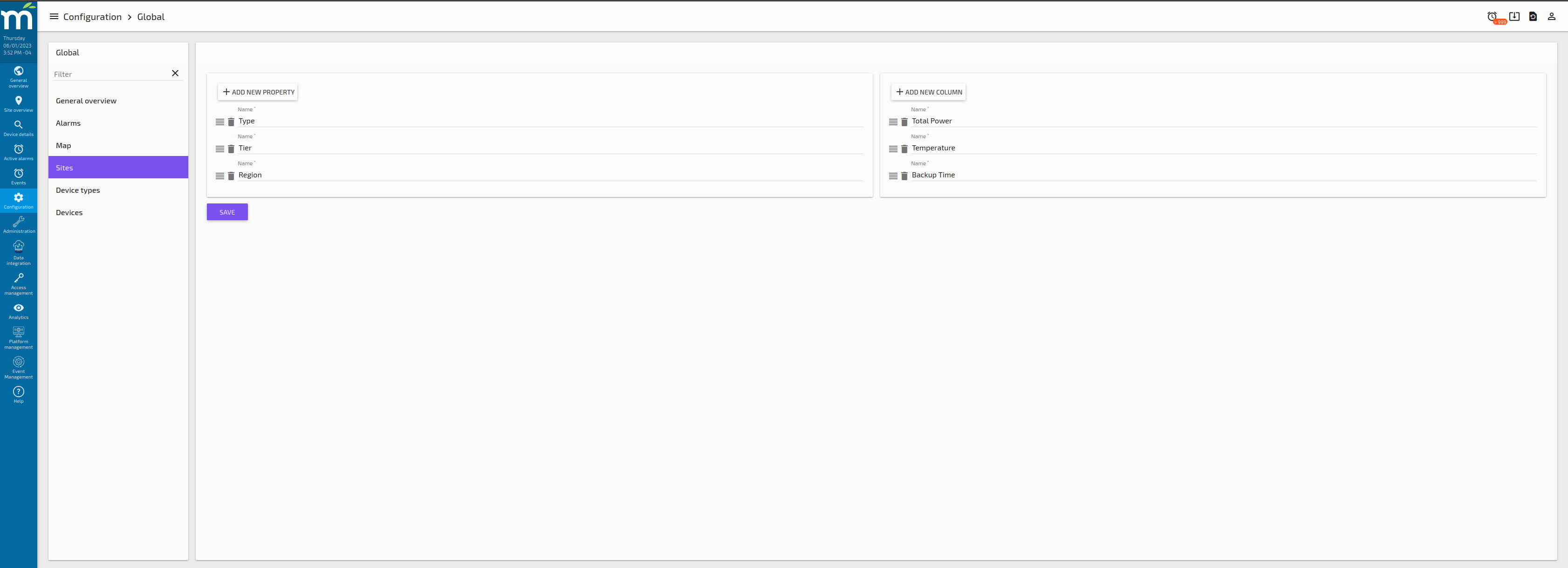
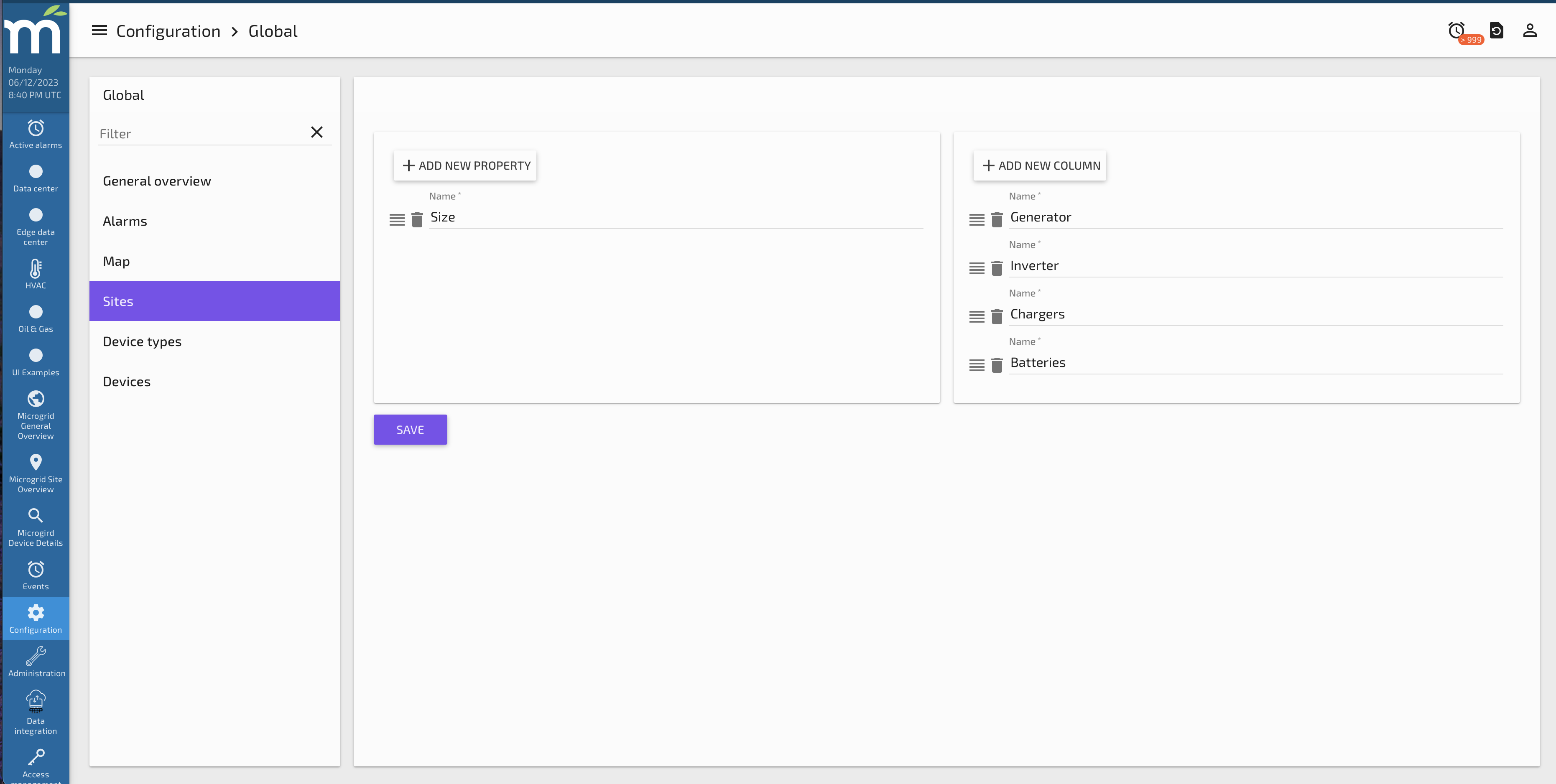
Sites
The Sites configuration screen allows the user to define the Properties and Columns that will be used to Configure the Sites.
Properties are intended to add more structured information to the Sites. and those will be reflected on the form that is used to create a new Site.
Columns are intended to standardize which columns will be shown in the Sites Table component used in the Global Overview Page.
Next image shows how the new properties appear as text inputs in the Site creation form.
Next image shows how the columns defined in the Global Configuration for Sites appear as groups that can be edited in the Site Configuration, Tab Columns.
This is how the Columns are shown in the Site Table component in the General Overview page.
Device-Types
The Device types configuration screen allows the user to define the Properties and Columns that will be used to Configure the Device types.
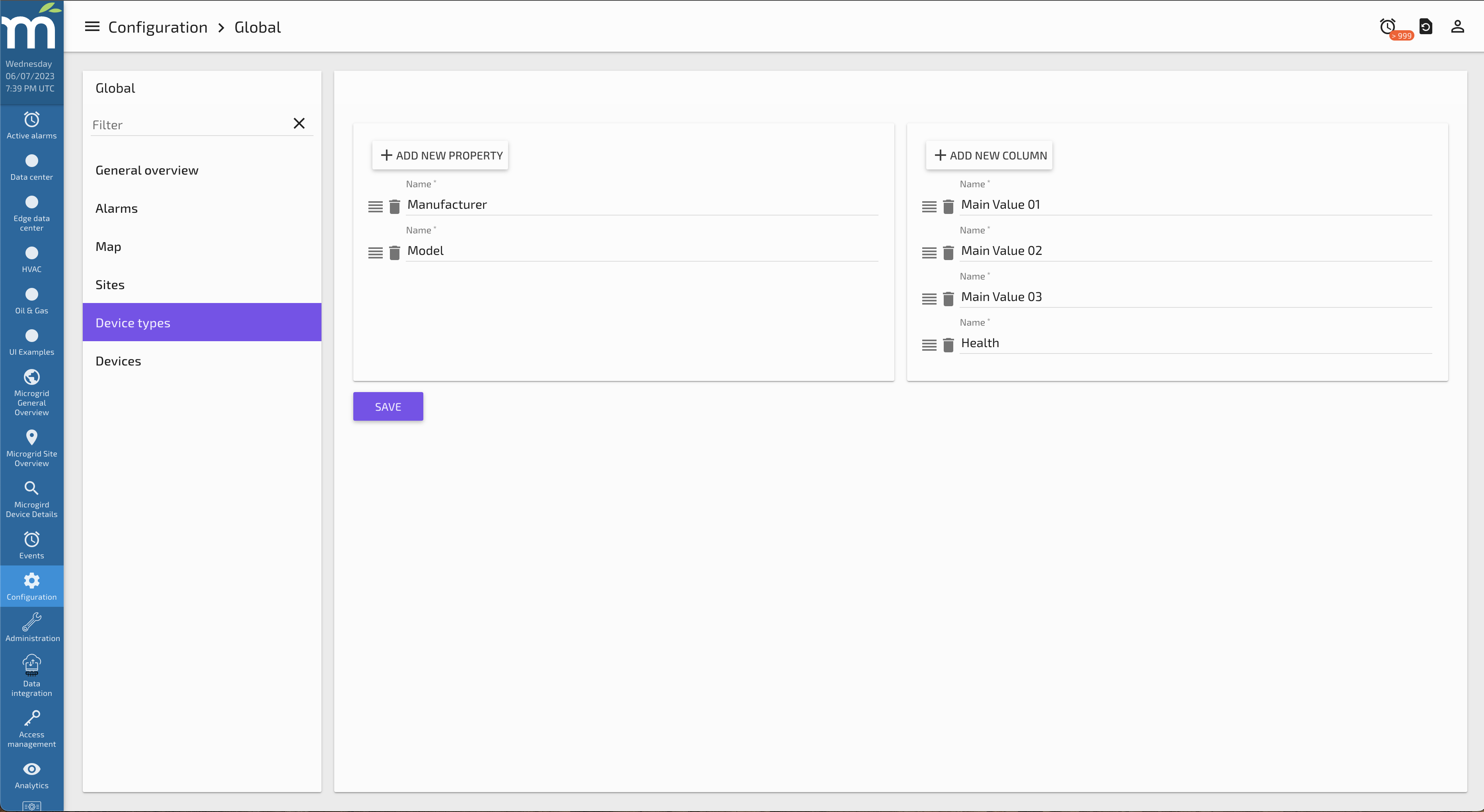
Properties are intended to add more structured information to the Devices of that type. and those will be reflected on the form that is used to create a new Device type.
Columns are intended to standardize which columns will be shown in the Device type configuration screen, columns tab component used in the Site Page.
Devices
The Devices configuration screen allows the user to define the Properties that used to configure new devices.
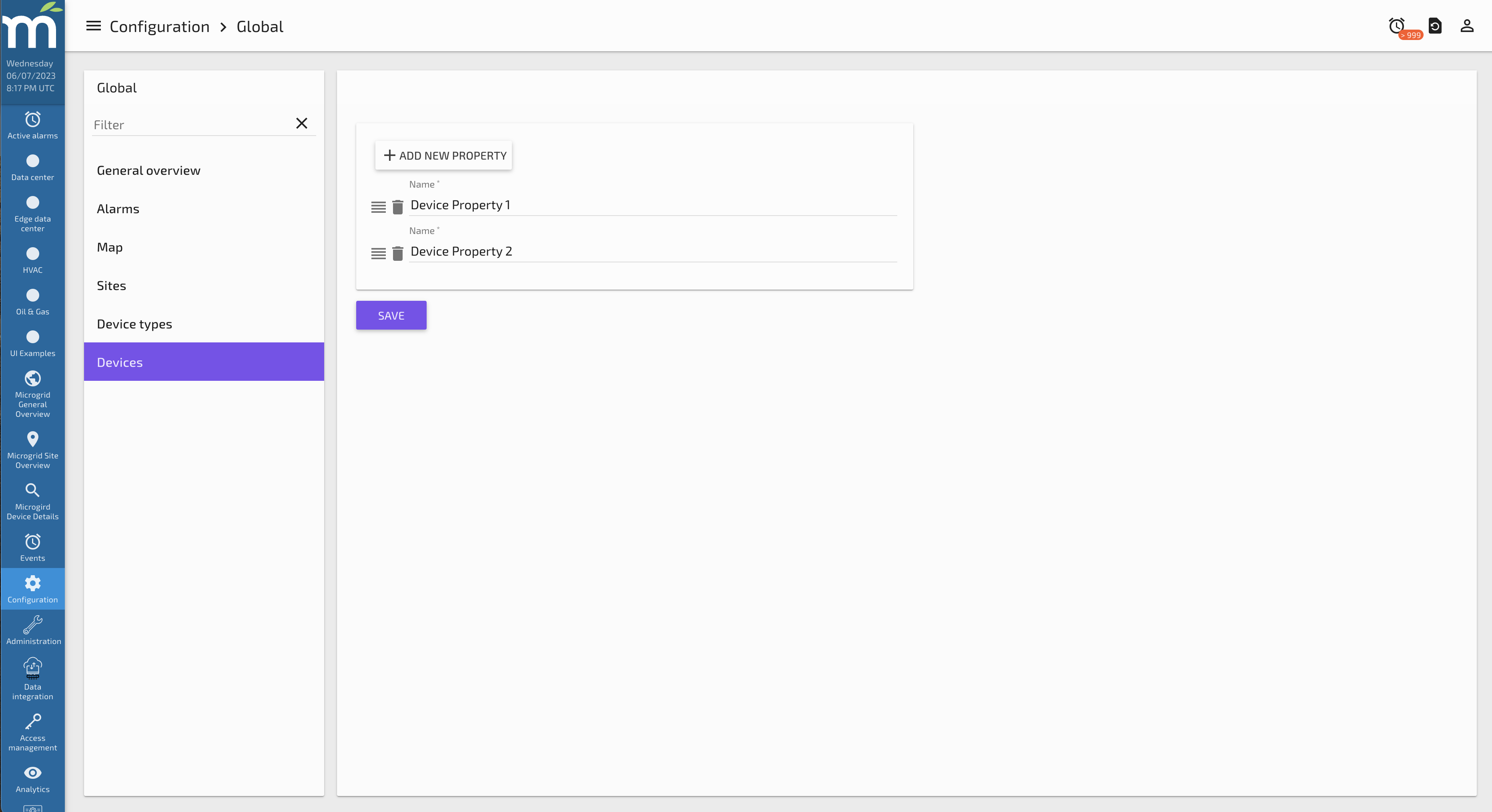
When adding a new device, these properties will be available to add to the device.
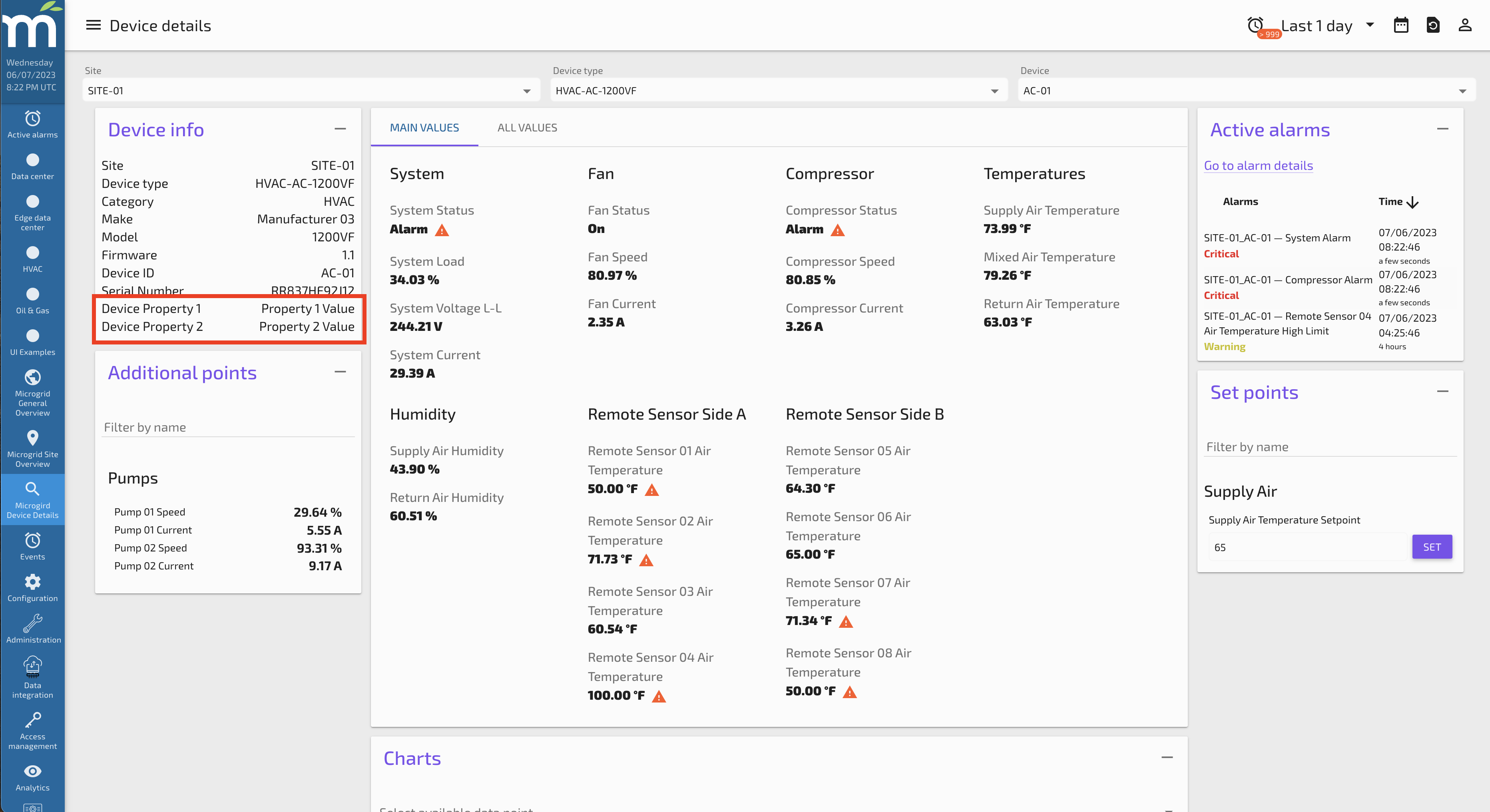
Also, when the user looks at a device in the Device details screen, these properties will be displayed alongside default Device properties in the Device Info panel.
Sites Configuration
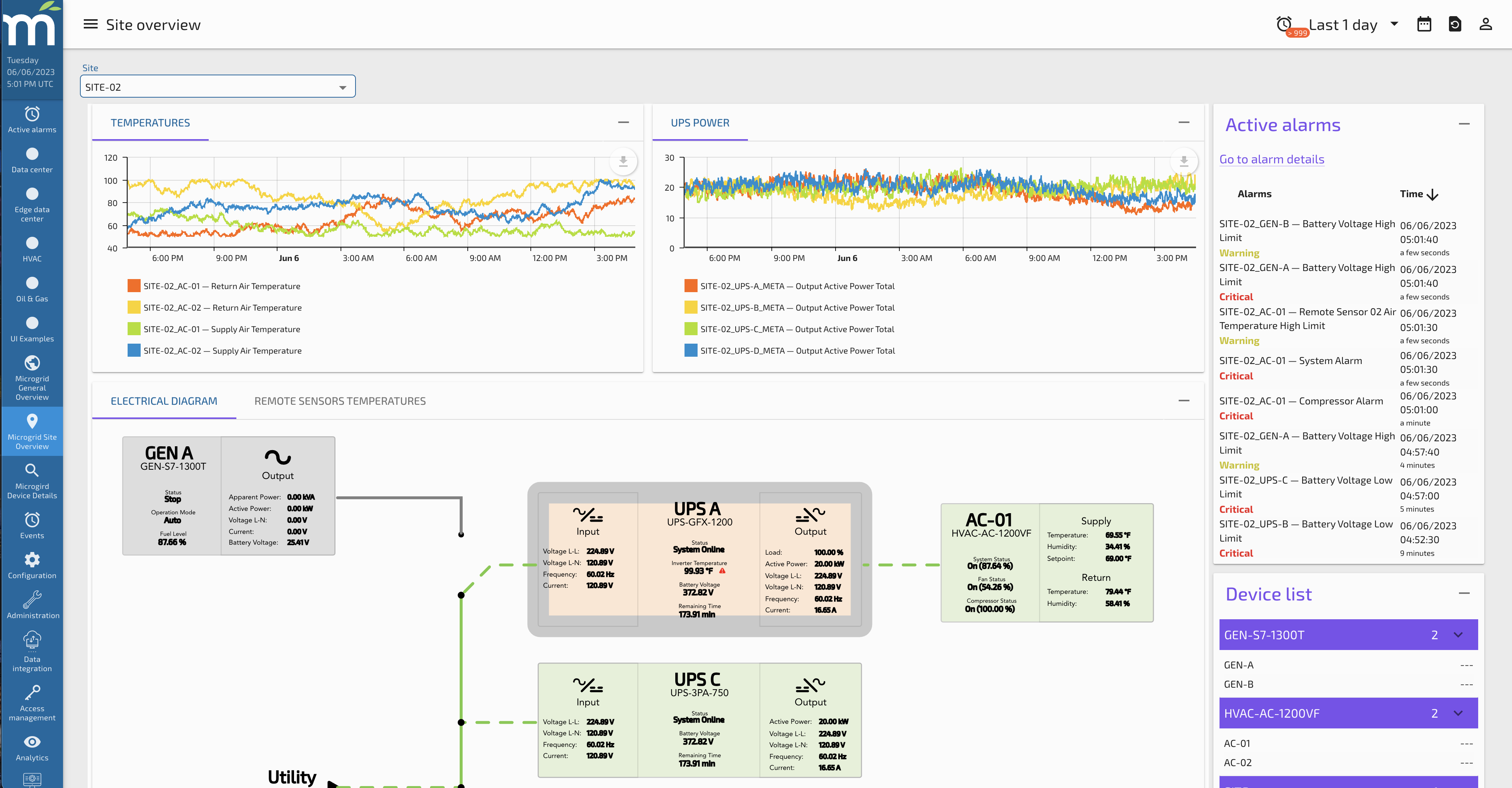
This page allows the user to configure Sites, which are intended to standardize the way Site information is shown. The idea behind this is to configure how the UI will show the data for Sites, so these settings act as a template for the overview screen. Each site defined here can have a different display layout, allowing the user to customize the view for every site.
The layout of this page can be configured with the following cards:
The options we have to configure in this page are:
-
Site
-
Tabs
-
KPIs
-
Columns
-
Devices
Each of them are described below:
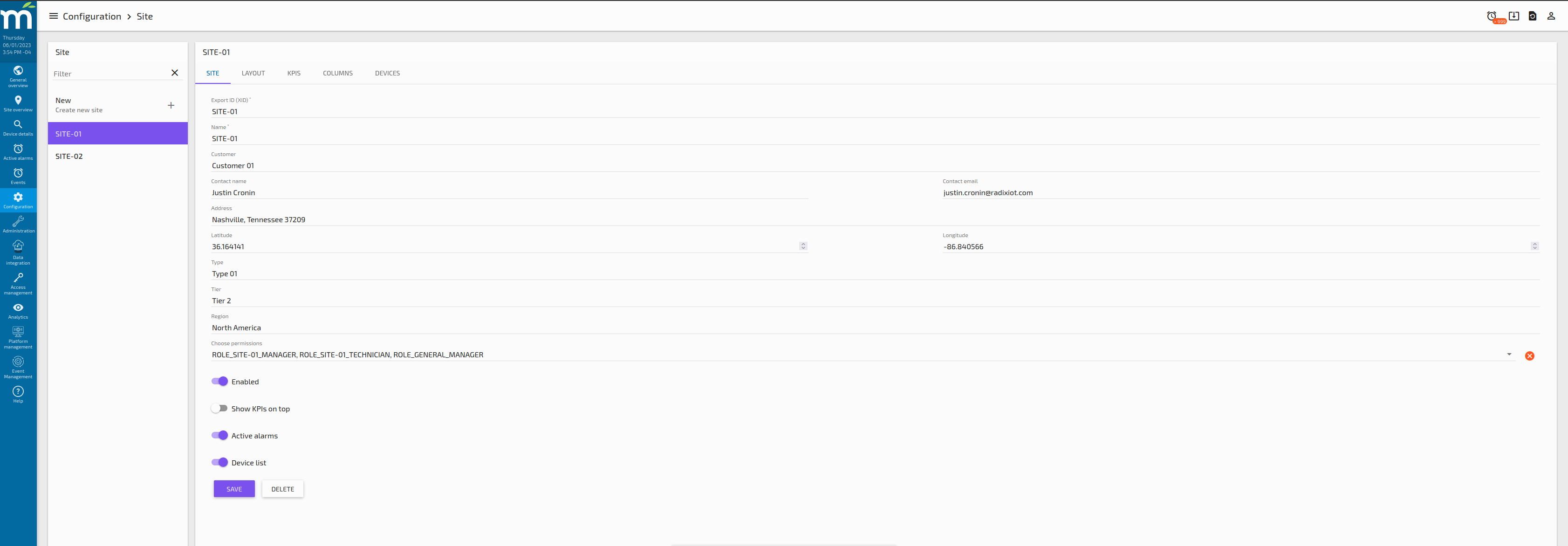
Site Tab
This tab holds the main information related to the Site, it is a form that includes the following inputs:
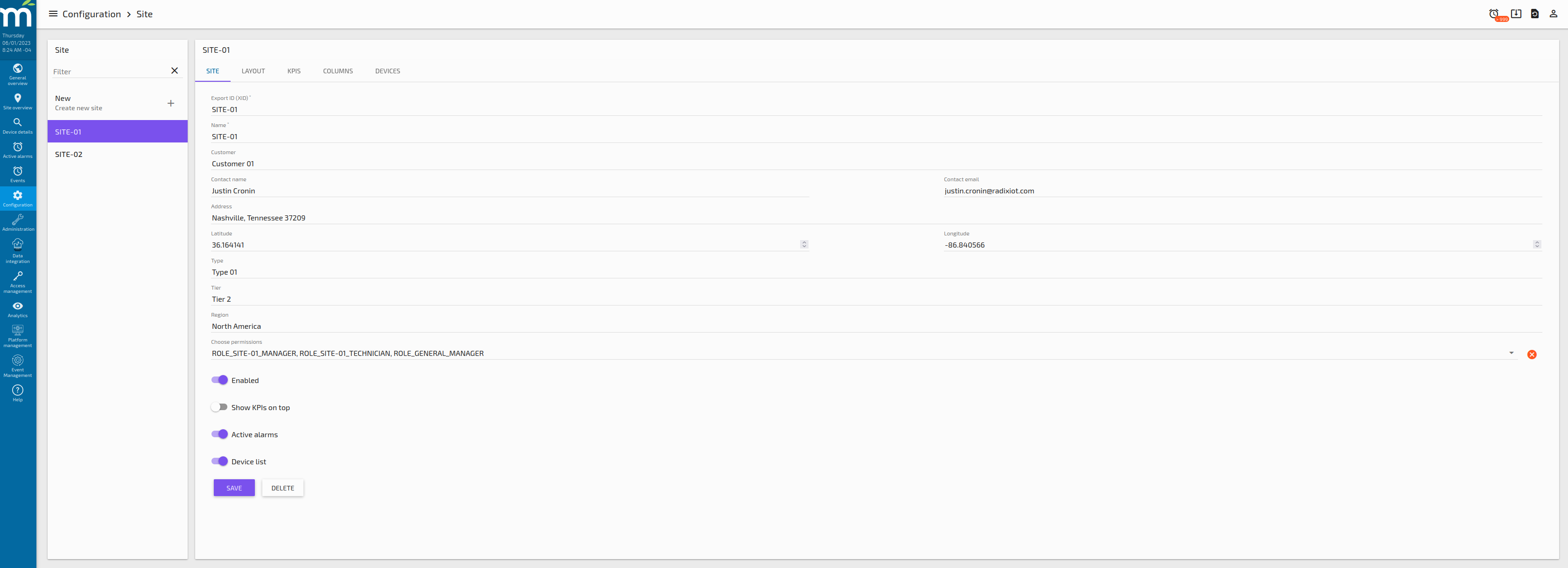
-
Export ID (XID): is a text input that need to be unique for each Site, the recommendation for this field is to have a structure like SITE-UniqueID, for example in our use case we have the following Sites XIDs:
-
SITE-01
-
SITE-02
-
-
Name: is a text input for the display name that will be shown in the drop downs and information panels.
-
Customer: is a text input that stands for the customer that we can assign to our site.
-
Contact name: is a text input that stands for the contact name of the person assigned to this site.
-
Contact email: is a text input that stands for the email address of the contact person assigned to this site.
-
Address: is a text input that stands for the physical address of this site.
-
Latitude: is a text input that stands for the latitude of this site in numeric, decimal degrees format (i.e. 40.123).
-
Longitude: is a text input that stands for the longitude of this site in numeric, decimal degrees format (i.e. -74.123).
-
Type: is a text input that for our use case is configured as a a new site Property in the Global Configuration.
-
Tier: is a text input that for our use case is configured as a a new site Property in the Global Configuration.
-
Region: is a text input that for our use case is configured as a a new site Property in the Global Configuration.
-
Choose Permissions: is a multi-select of Roles/Users that are created in the Access Management - System Permissions Section of Mango. Selecting these grants those Roles/Users permission to view this site.
-
Enabled: is a toggle button that enables this site to be displayed in the site overview.
-
Show KPIs on top: is a toggle button that displays the site KPIs on top (if enabled) or on the left (if disabled).
-
Active alarms: is a toggle button that enable the Active Alarms card for this site if needed.
-
Device list: is a toggle button that enable the Device list card for this site if needed.
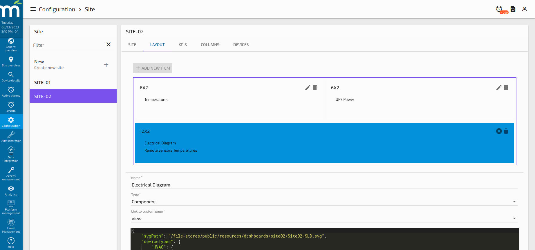
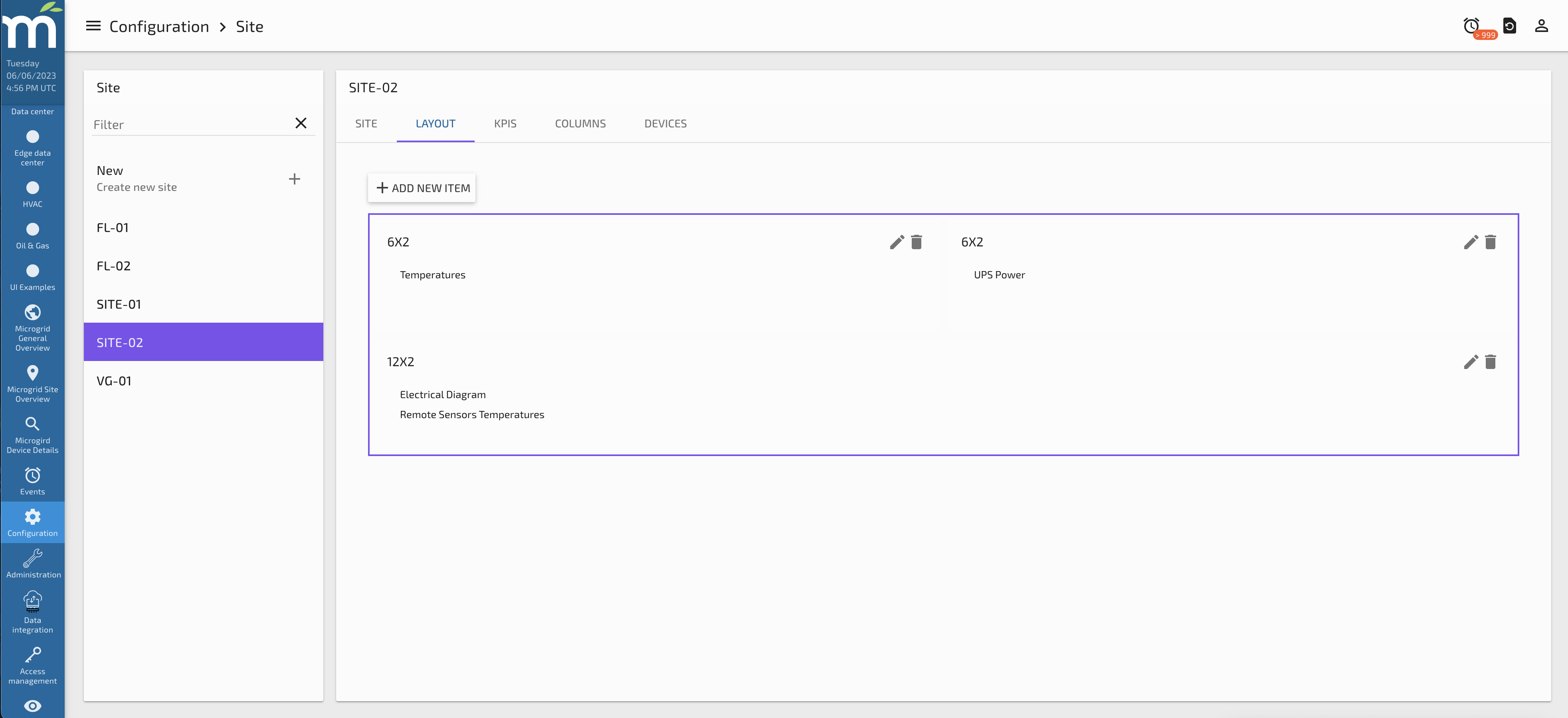
Layout Tab
This tab allows the user to set the tabs that will be displayed on the “Site Overview” page main card. These can be 1 of 4 types:
Tab Type: Dashboard
This tab type allows the user to display an existing Dashboard Designer Page that needs to be already created. So, if this type is selected, a new dropdown will appear with the existing Dashboard Designer Pages that were previously created, like the following images.
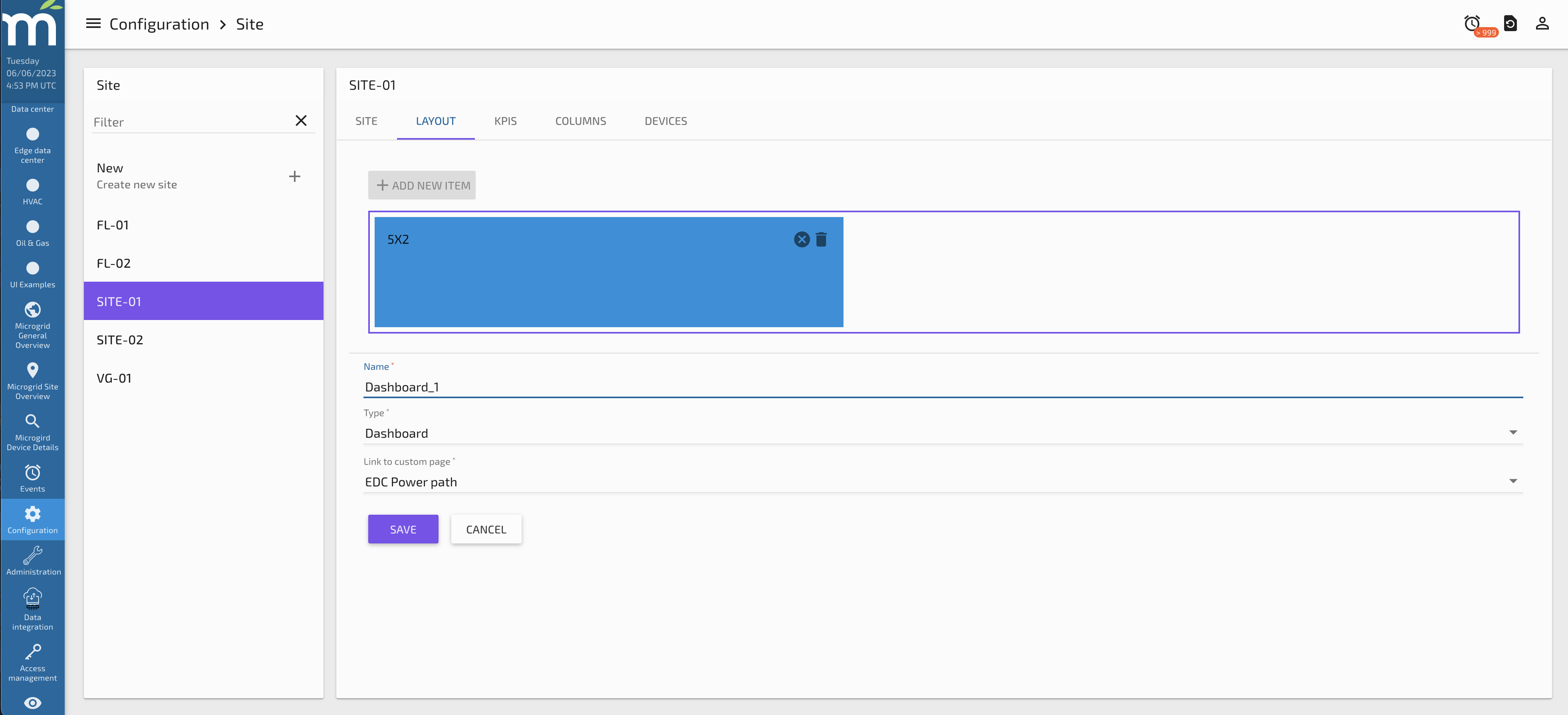
By clicking save in this page, a new Tab will be displayed for this Card as the following image shows. We will have the ability to add multiple Tabs in the same Card.
After adding a second tab in this Card, the result in the Site Overview Page will be like the following image.
Tab Type: Watchlists
This tab type allow the user to display one of multiple Watchlists in the same card. When the type Watchlist is selected, a new button “ADD NEW WATCHLIST” appear, so by clicking this button a prompt to add a new watchlist with several options shall appear, as the following screenshot.
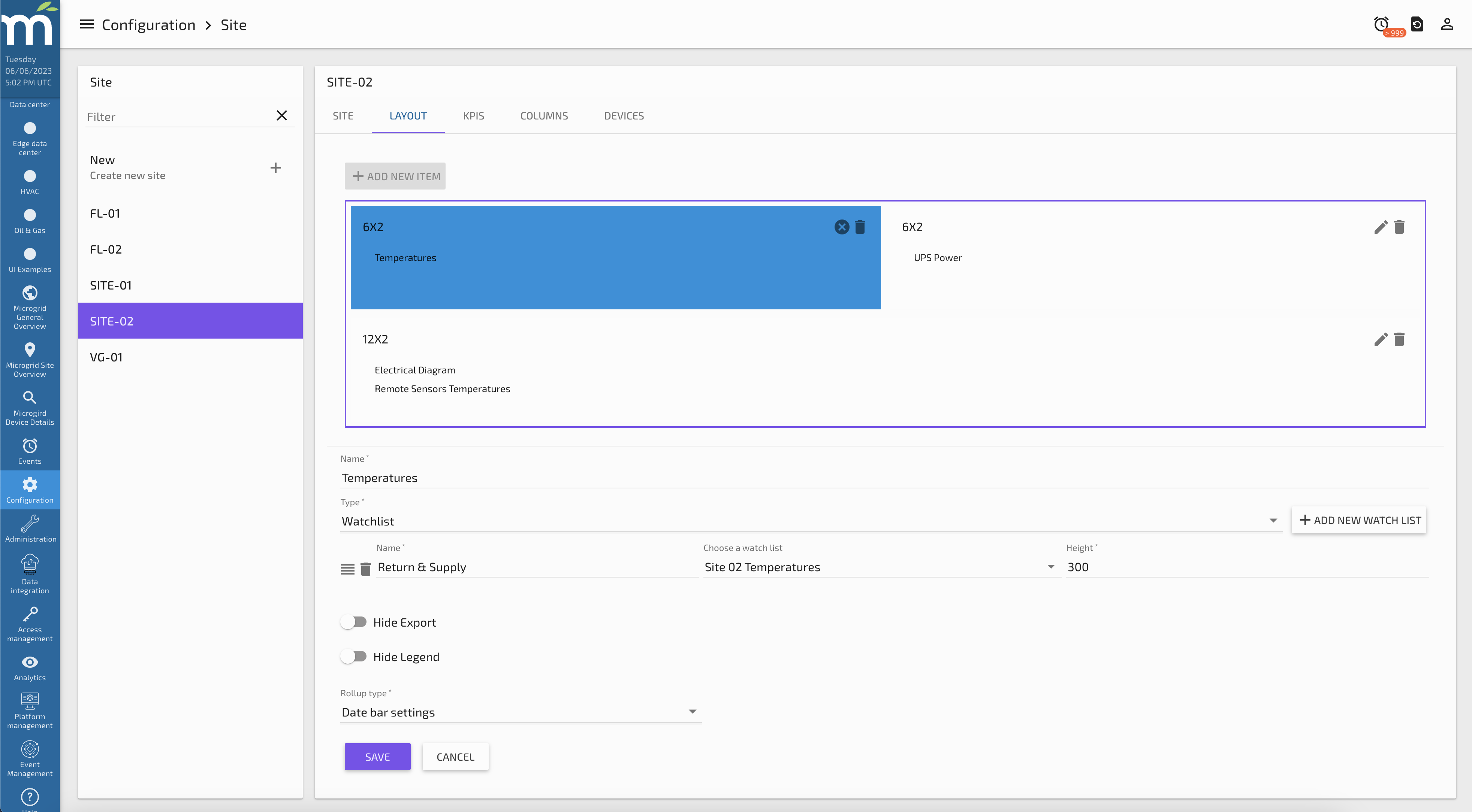
For each Watchlist we need to add a Name, which will be a display name. Then there is dropdown to select a watchlist that should be created previously. The Height of the Watchlist can be set so we can control the card height. Also there are options to “Hide Export” which will disable the option to export the chart in any way, same situation about the legend, that can be disabled with the “Hide Legend” toggle button. Finally, the Rollup Type can be selected if we want to have one different than the Date Bar Settings.
Multiple Watchlists can be added if you click on the “ADD NEW WATCHLIST” button again, same options will be prompted for the new Watchlist. The order of those watchlists can be change by dragging them from top to bottom using the drag button highlighted in yellow in the following screenshot.
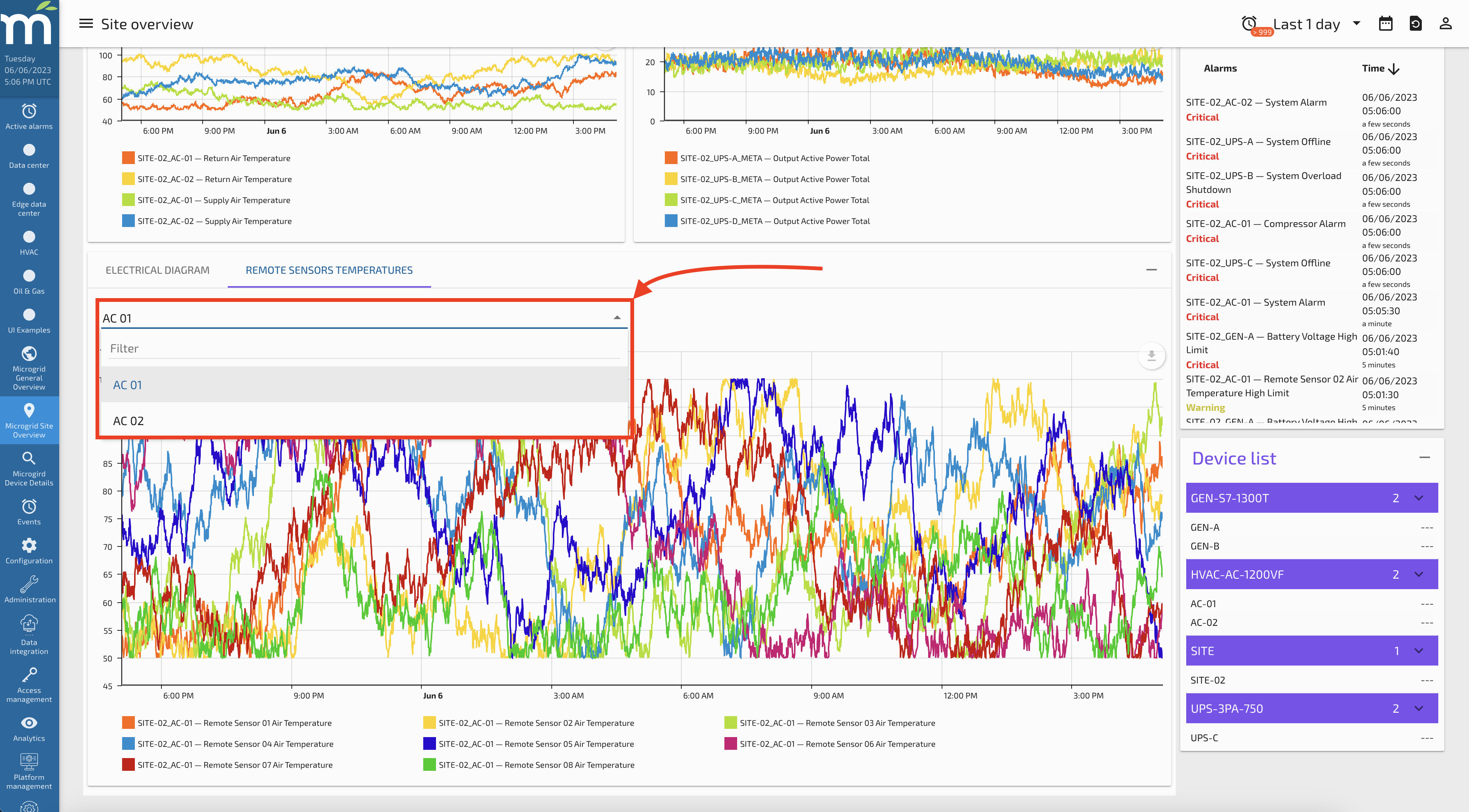
At the end, when we review the changes in the Site Overview Page, a new card will appear with a dropdown of watchlists to show like is shown in the following picture.
Tab Type: Component
This tab type allows the user to display any custom user module component defined elsewhere in the system and add it as a tab to the site details screen.
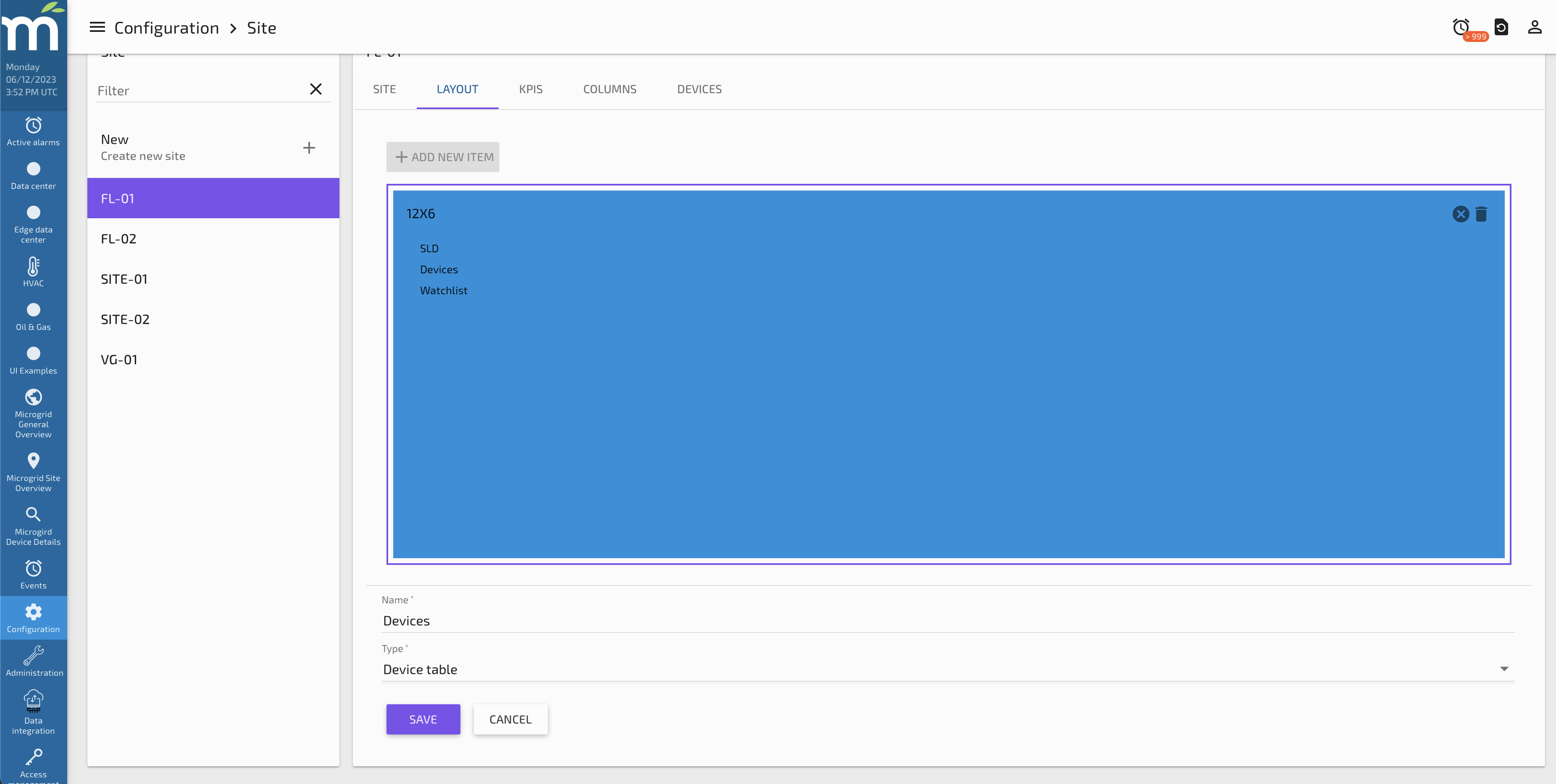
Tab Type: Device Table
This tab type allows the user to display a table of the devices assigned to this site as defined in the Devices configuration tab under the Site Configuration section.
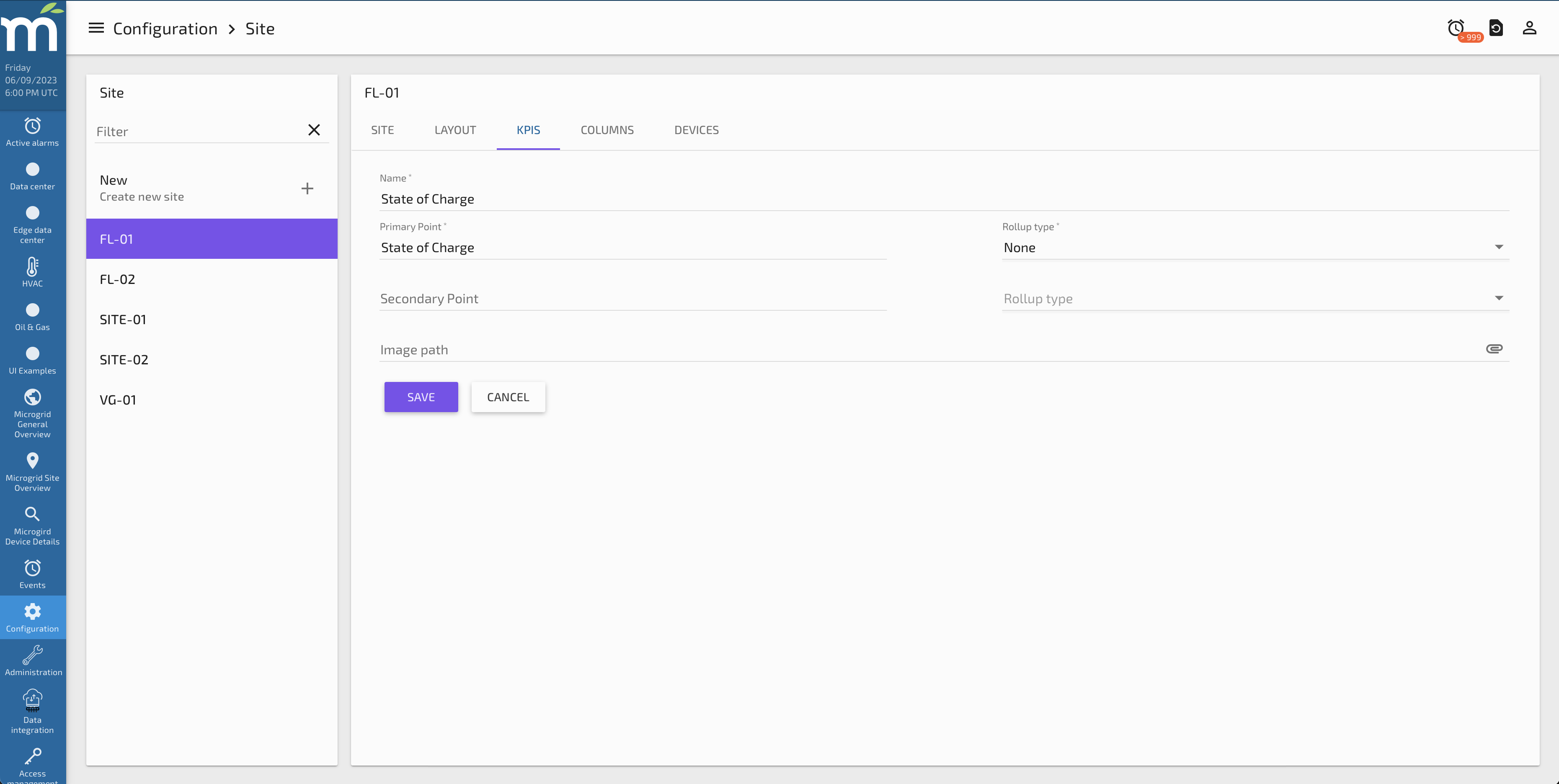
KPIs Tab
The KPIs screen allows the user to include KPIs on the General Overview screen. The user can choose 2 points to be displayed (must have the tag, deviceType=SITE), and how those points might be rolled up should that be desired.
Here is an example of configuring a KPI.
And here is how that KPI appears on the Site Overview screen.
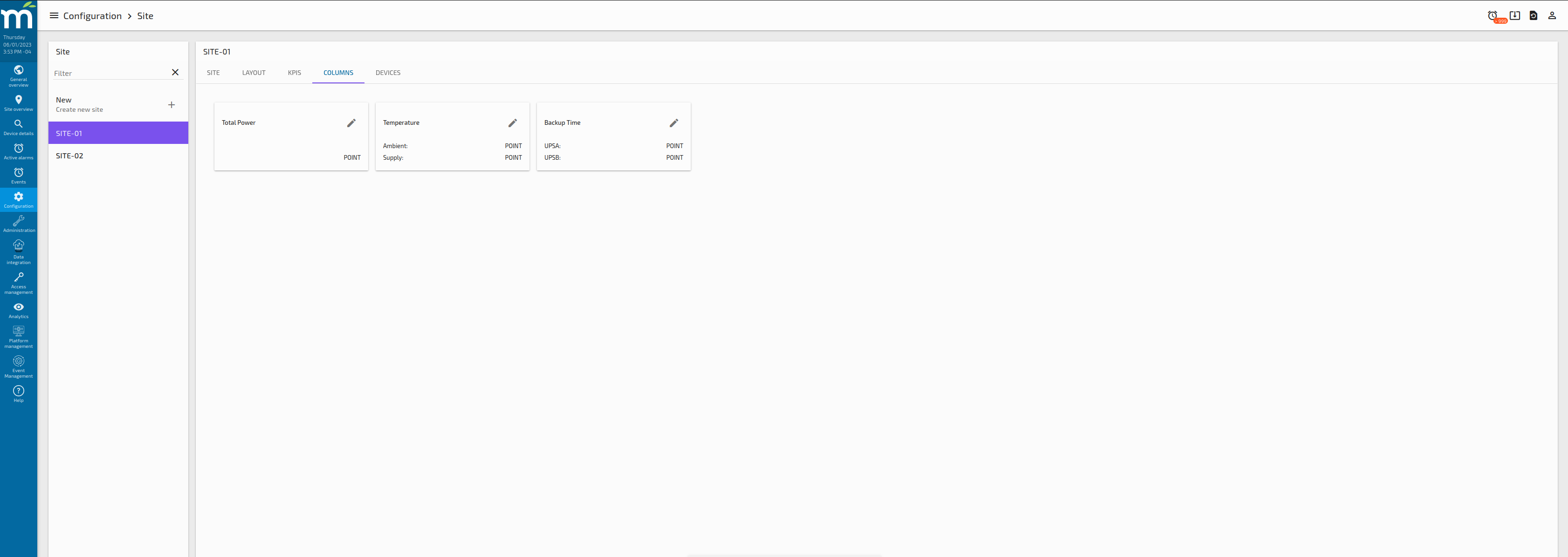
Columns Tab
This tab allows the user to set which data points will be used for each column of the “Sites Table” component that is intended to be used in the “General Overview” page. So the Columns need to be defined first in the Global Configuration - Sites Page. Any that are not will appear highlighted on the Site Configuration - Columns screen.
And here is how those columns will appear on the General Overview screen, Sites table.
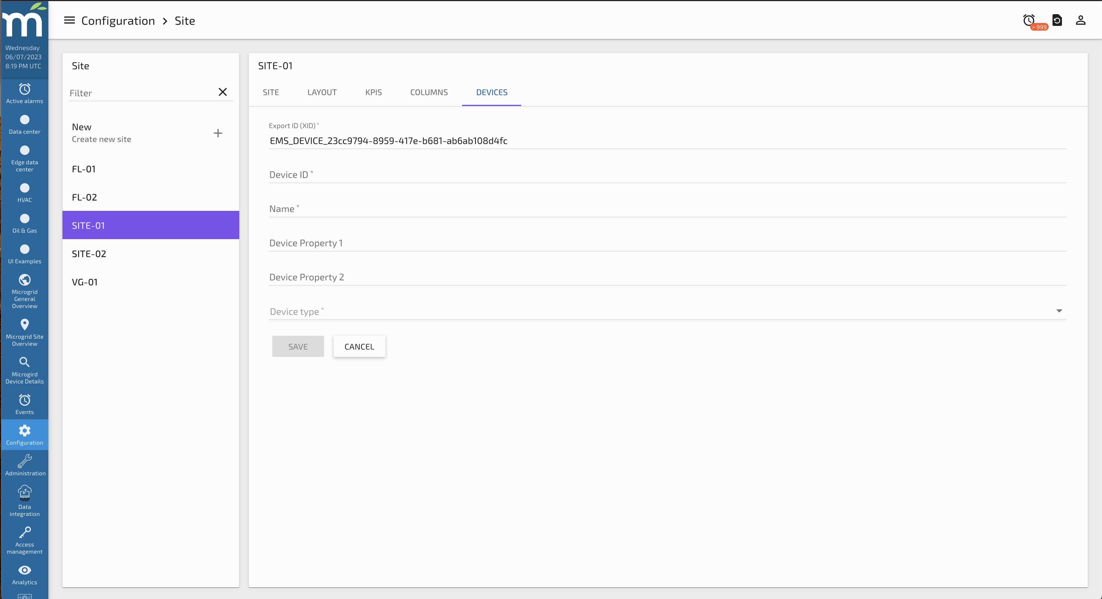
Devices Tab
This tab allows the user to set up the devices in this site. The devices will be displayed in the Device List card that can be enabled on the main Site Configuration - Site Tab.
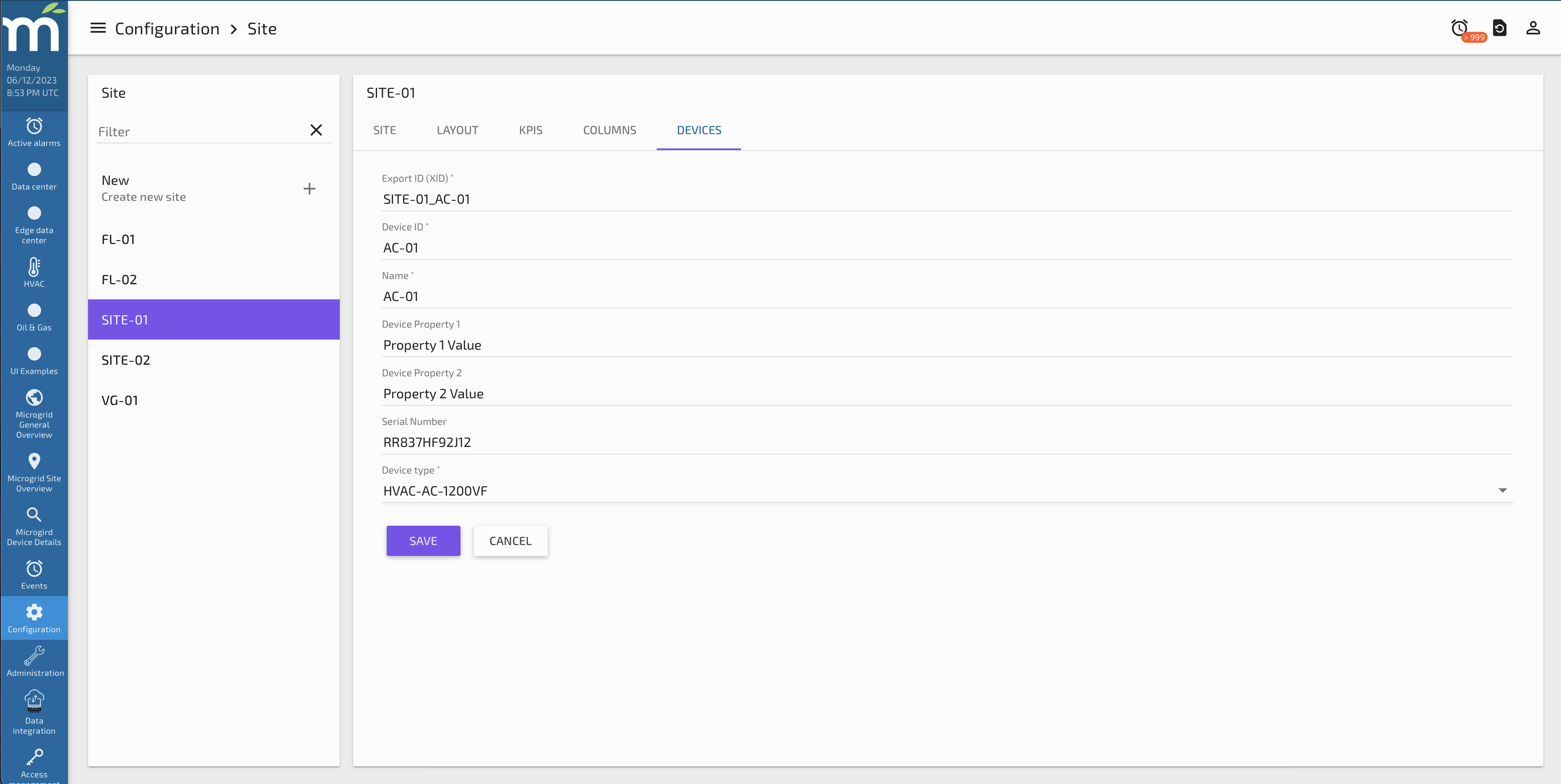
This tab holds the main information related to the Device, it is a form that includes the following inputs:
-
Export ID (XID): is a text input that need to be unique for each Device, the recommendation for this field is to have a structure like SITENAME_DeviceUniqueID, for example in our use case we have the following Device XID:
- SITE-01_AC-01
-
Name: is a text input for the display name that will be shown in the drop downs and information panels.
-
Device Type: The type to be assigned to this device. These are pre-defined in the Device Types Configuration section.
Device Types Configuration
This page allows the user to configure Device Types, which are intended to standardize the way device specific information is shown. The idea behind this is to configure how the UI will show the data for devices that are the same type, so the Device Type acts as a device template.
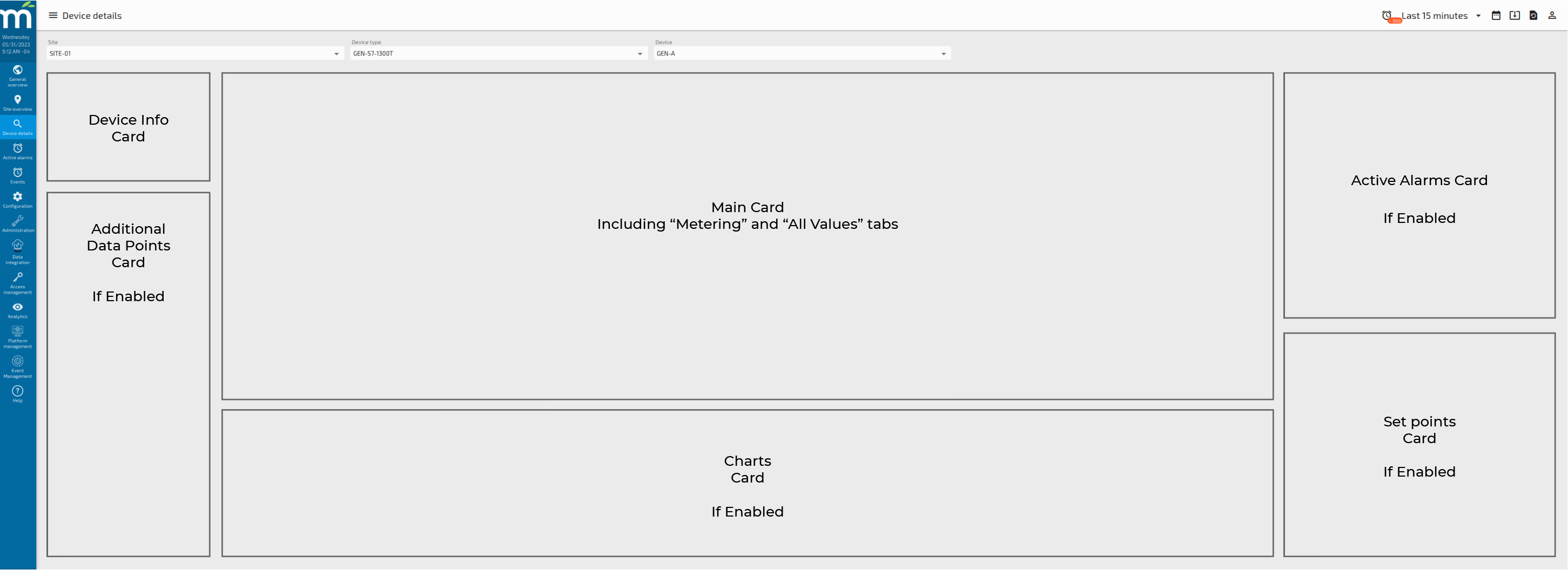
The configuration we can set in this Device Types Configuration page will be displayed in the “Device Details” page and has the following layout.
The options we have to configure in this page are:
-
Device Type
-
Metering
-
Set points
-
Additional Points
-
Columns
Each of them are described below:
Device Type Tab
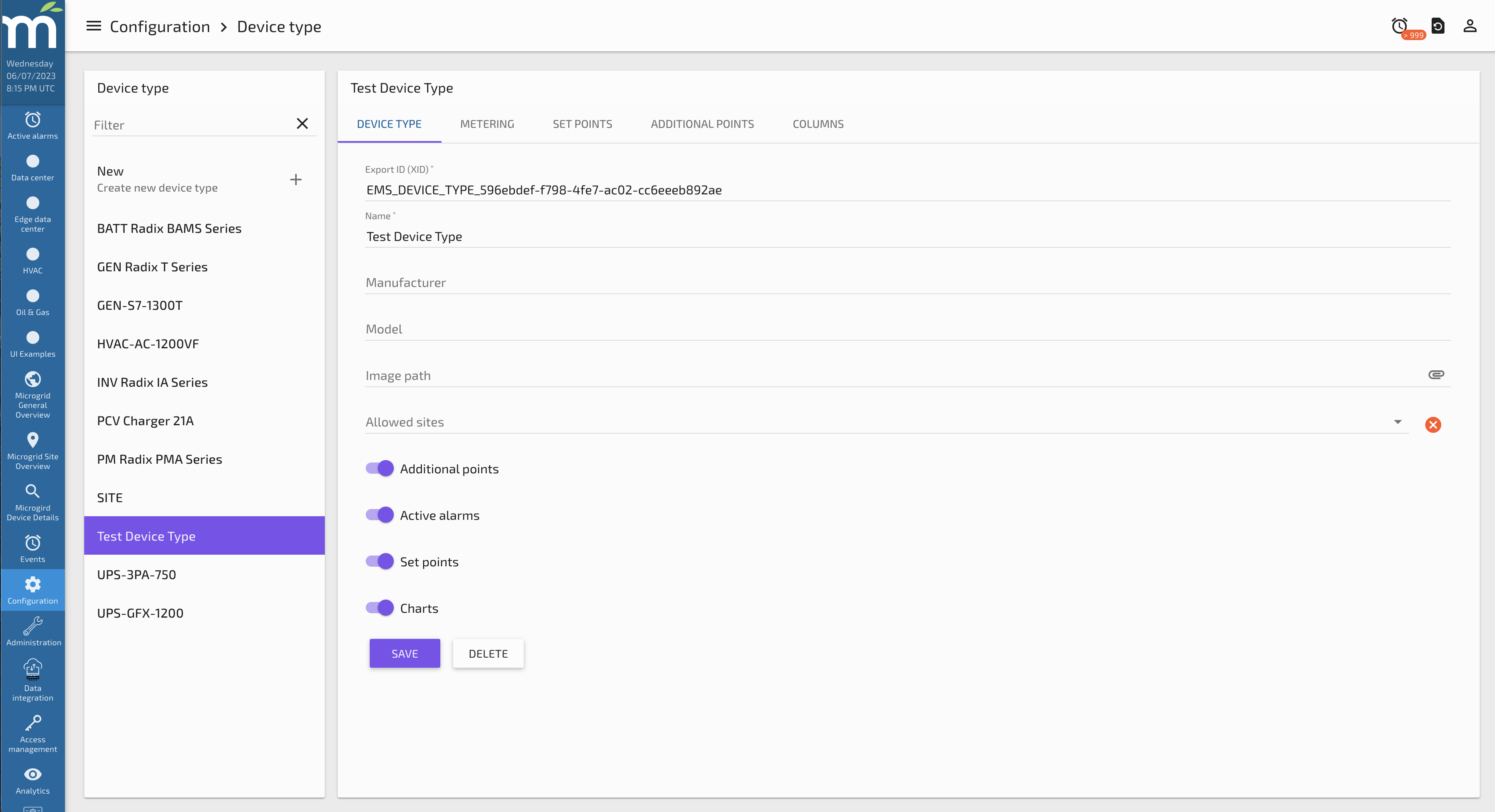
This tab holds the main information related to the Device Type, it is a form that includes the following inputs:
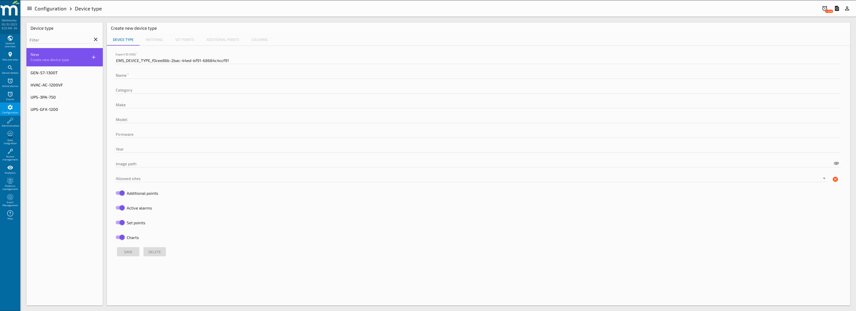
-
Export ID (XID): is a text input that need to be unique for each Device Type, the recommendation for this field is to have a structure like CATEGORY-MODEL, for example in our use case we have the following Device Types XIDs:
-
UPS-GFX-1200
-
UPS-3PA-750
-
GEN-S7-1300T
-
HVAC-AC-1200VF
-
-
Name: is a text input for the display name that will be shown in the drop downs and information panels.
-
Category: is a text input (Custom property in our use case) that stands for the category that we can assign for our device type, for example in our use case we have two different UPS types, but we can group both in the same category of UPS.
-
Make: is a text input (Custom property in our use case) that stands for the manufacturer of the device.
-
Model: is a text input (Custom property in our use case) that stands for the specific model of the device.
-
Image path: is a text input for the path within the system File Store that is intended to have the device type image.
-
Allowed Sites: is a multi-select of Sites that are created in the EMS that allows the user to select on which Sites the device types will be available.
-
Additional points: is a toggle button that enable the Additional Points card for this device type if needed.
-
Active Alarms: is a toggle button that enable the Active Alarms card for this device type if needed.
-
Set Points: is a toggle button that enable the Set Points card for this device type if needed.
-
Charts: is a toggle button that enable the Charts card for this device type if needed.
Metering Tab
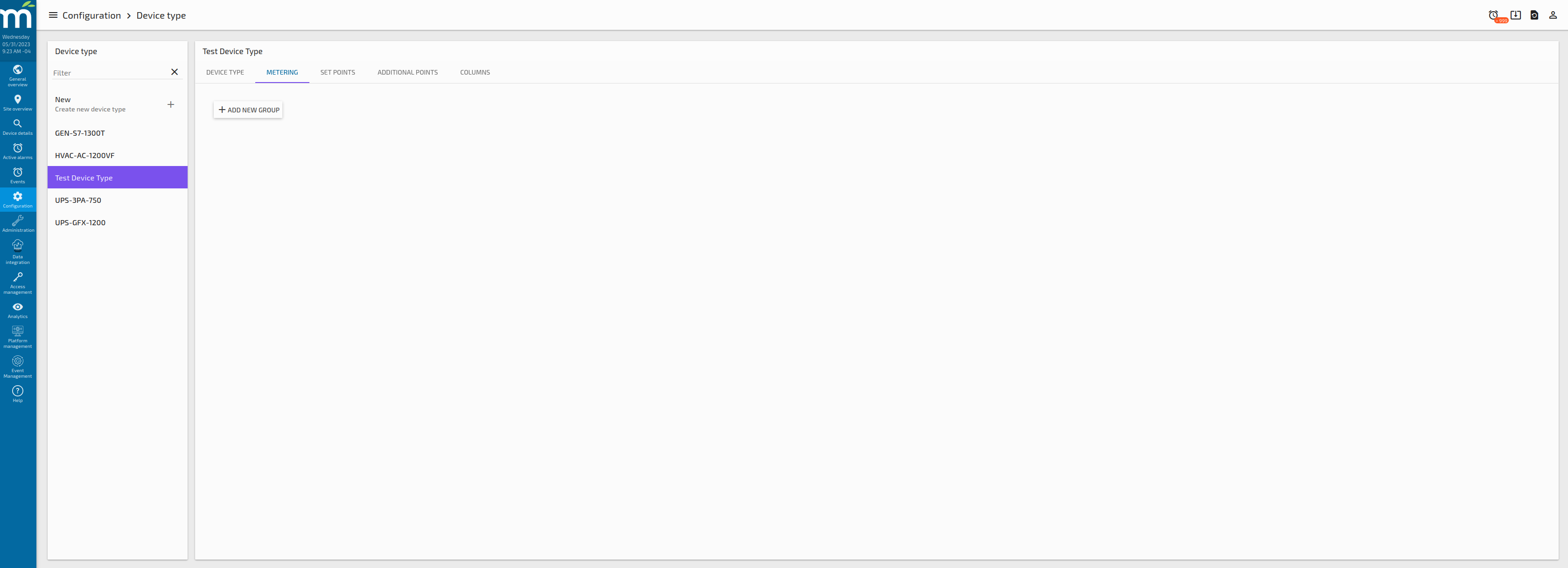
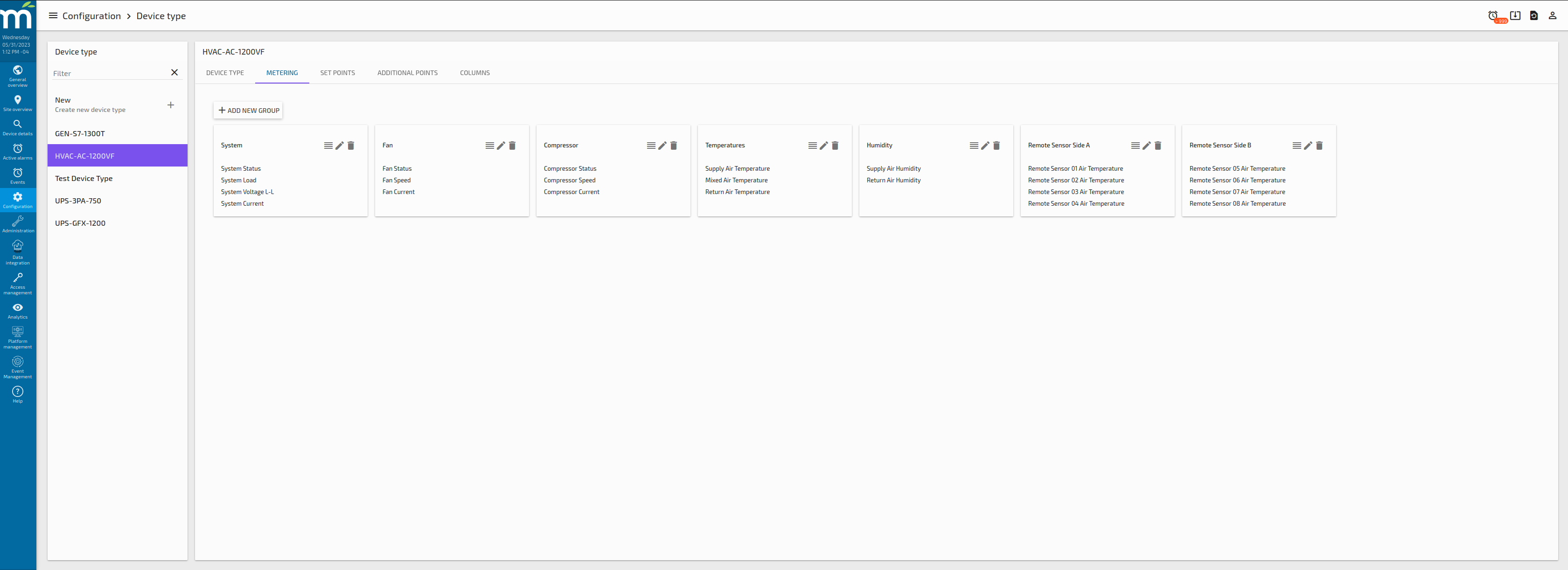
This tab allows the user to create groups of data points to be shown in the Main Card, the idea is to provide the user with a flexible way to group and show the most important data points related to a Device Type, so all the devices of the same type will show the data in the same way.
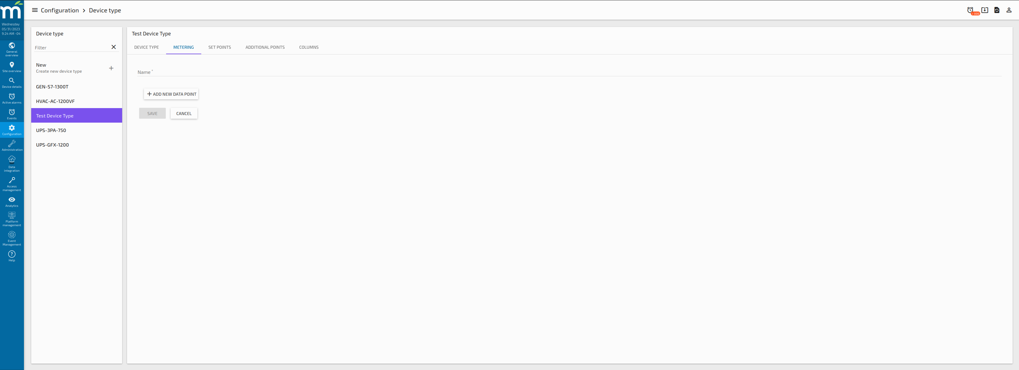
By Clicking on the “ADD NEW GROUP” Button we will have the form to add the group name and add new data points with the “ADD NEW DATA POINT” Button:
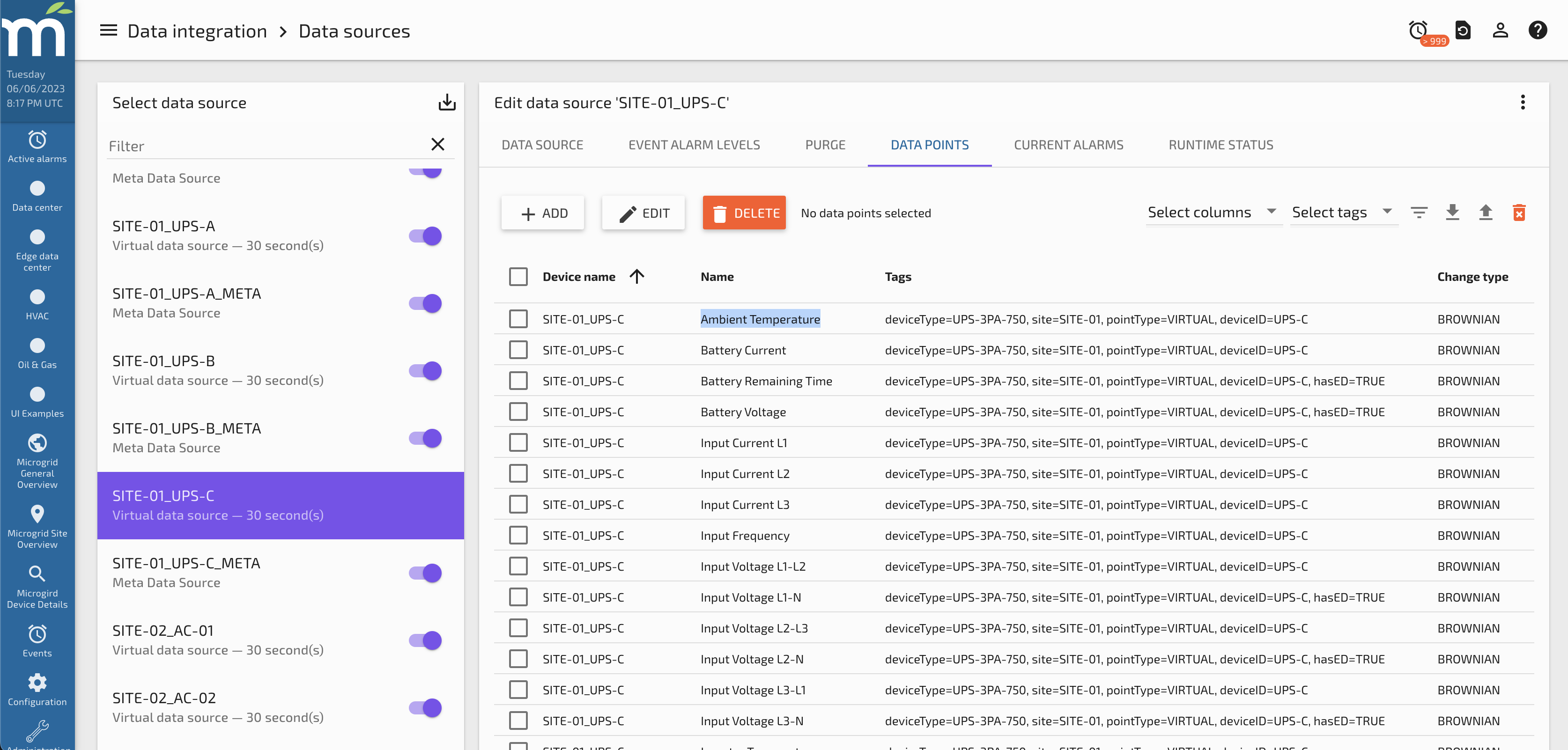
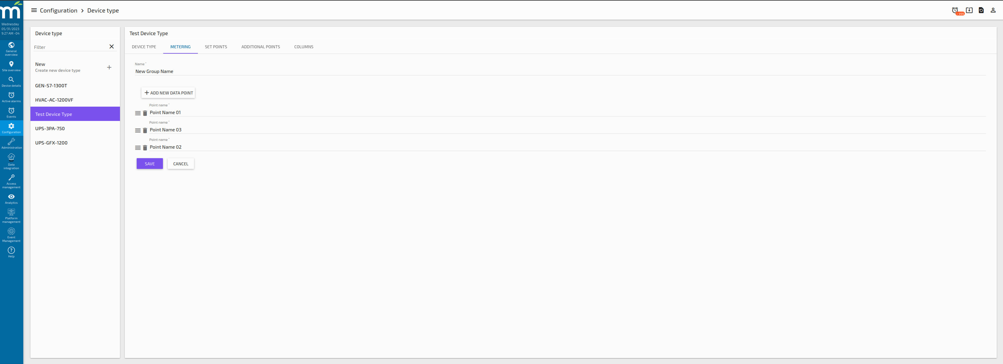
Multiple data points can be added into the same group, and also the order can be changed by using the drag and drop icon besides the delete data point icon. Important is to mention that these data point names should match with the actual data point names so the user needs to be case sensitive.
Multiple groups can be created, edited and re-ordered as shown in the following screenshot.
Set Points Tab
This tab allows the user to create groups of data points to be shown in the Set Points Card as editable data points. The configuration of this page is similar than the Metering Tab, where groups of data points can be created, edited and re-ordered for each individual Device Type.
Additional Points Tab
This tab allows the user to create groups of data points to be shown in the Additional Points Card a list of points. The configuration of this page is similar than the Metering Tab, where groups of data points can be created, edited and re-ordered for each individual Device Type.
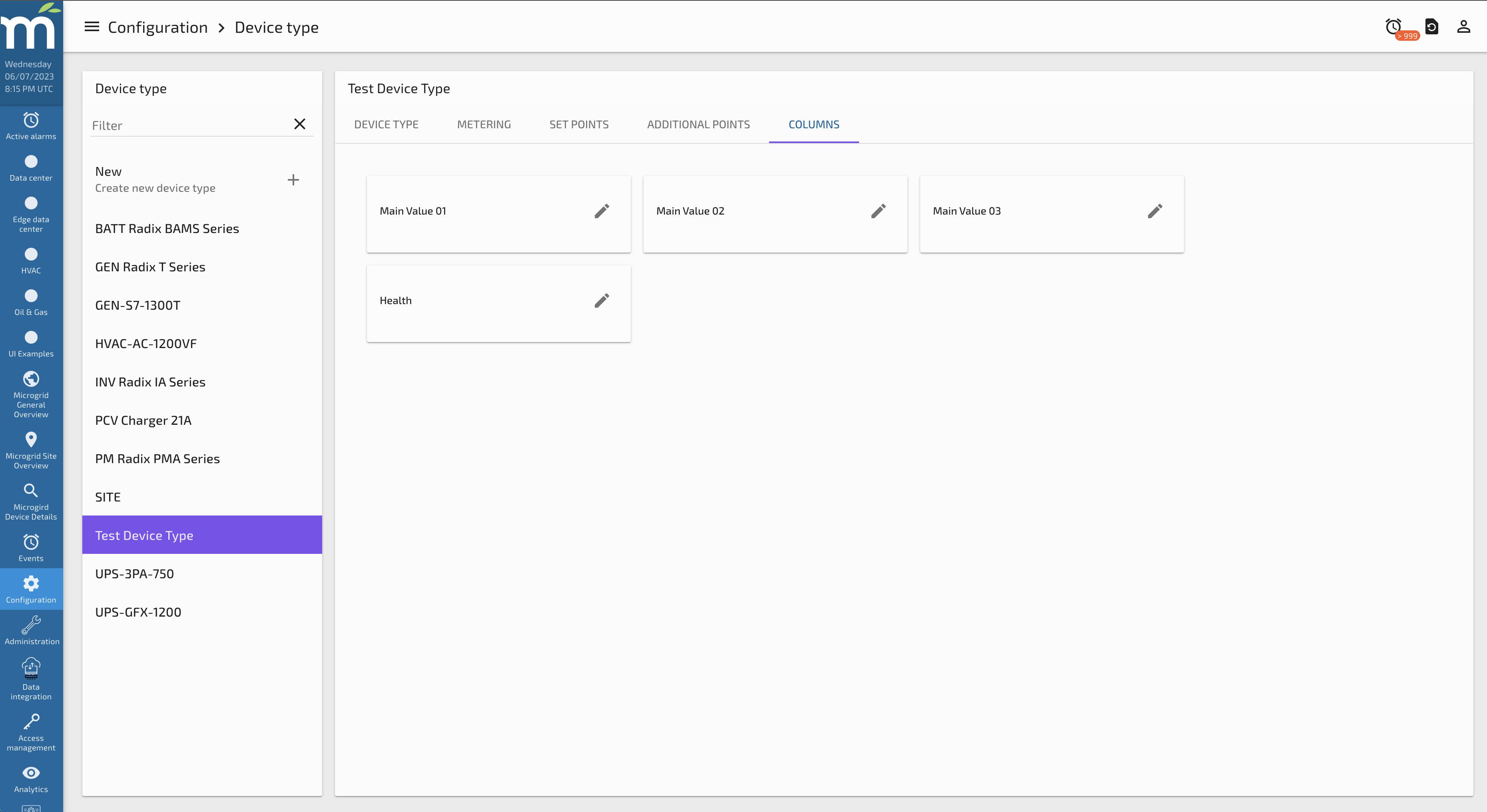
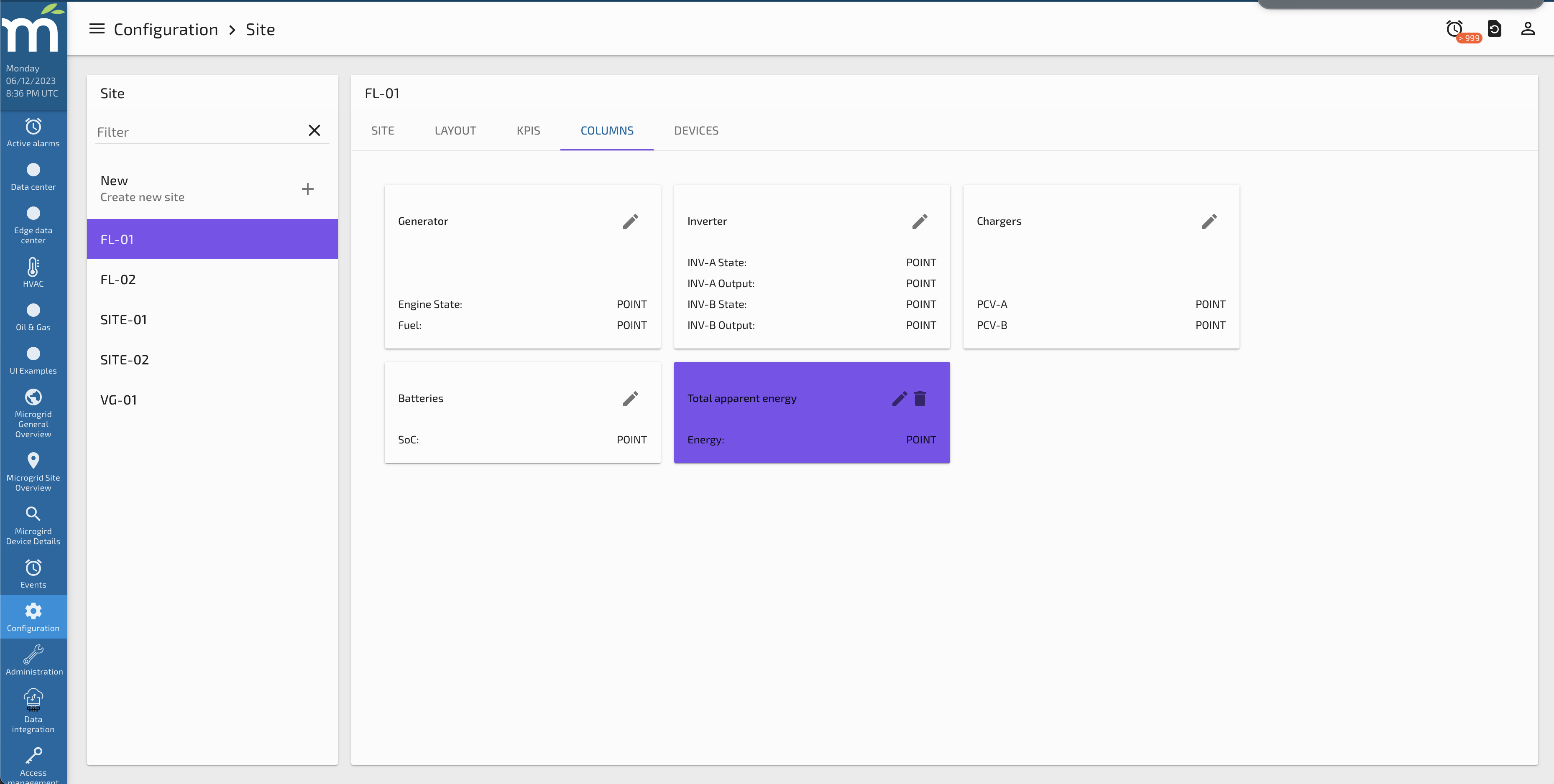
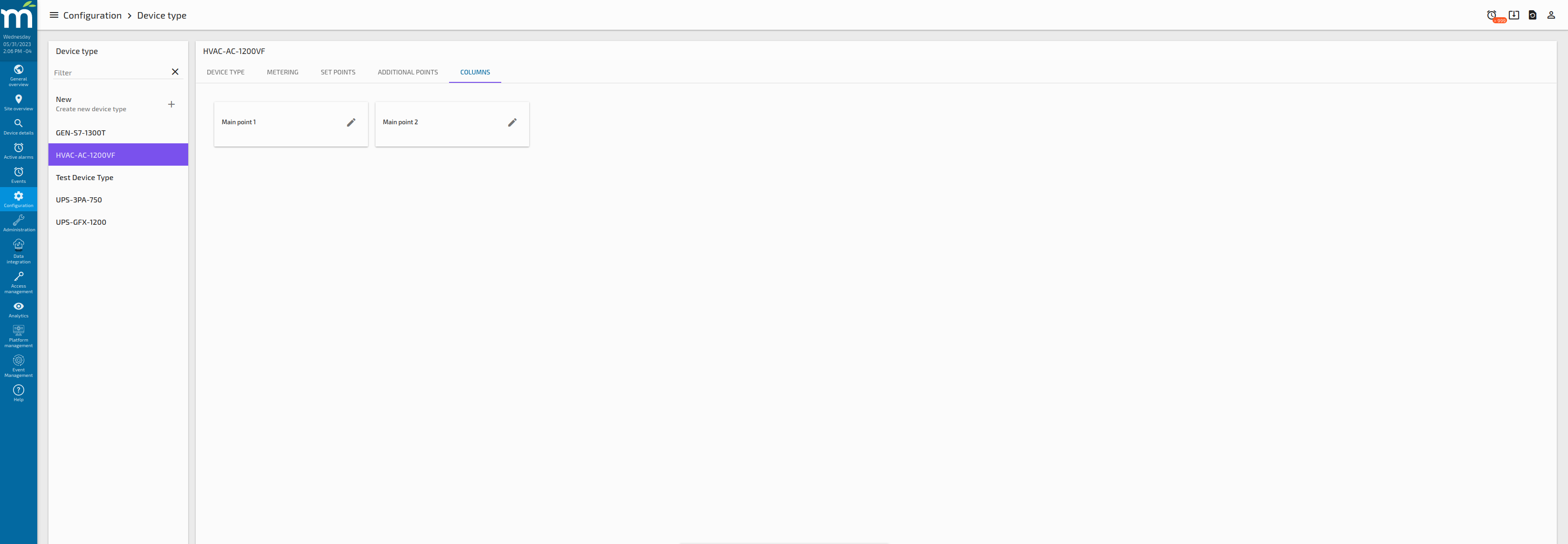
Columns Tab
This tab allows the user to set which data points will be used for each column of the “Devices Table” component that is intended to be used in the “Site Overview” page. So the Columns need to be defined first in the Global Configuration Page. The following image have two pre-defined columns.
When the edit button is clicked, a new button to “ADD NEW ITEM” will appear, and clicking that button will bring options to add a Data Point to the column, as shown in the following image.
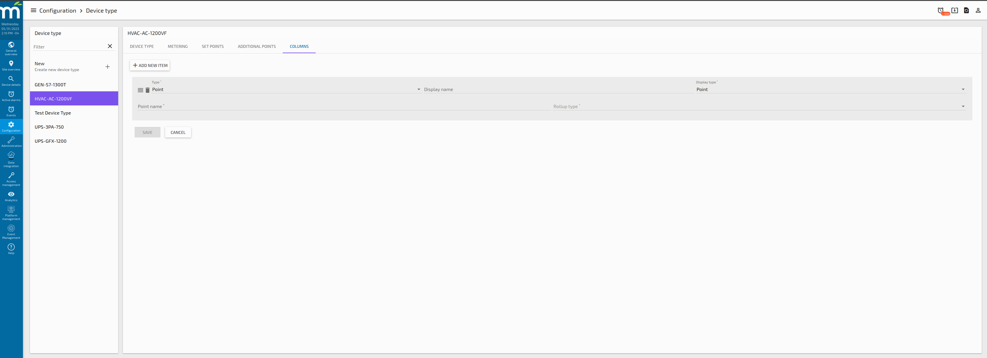
For the “Type” is a select field where you can select “Point”, which will serve to show a data point value in the column, or “Event” which will show a component that shows an alarm count for each alarm type.
The “Display Name” is a text field where the user can set a Display Name to show alongside the data point value.
The “Display Type” is a select field where we can decide to show the data point as a plain value or to use a badge to display its values. The badge option is intended to be used with the Boolean or Multistate Text Rendering Options.
The “Point Name” is a text field where the user needs to put the exact data point name it wants to relate to the column.
The “Rollup Type” is a select field where the user can decide which rollup type apply to display the data point value, where “None” means that the real time value will be displayed.
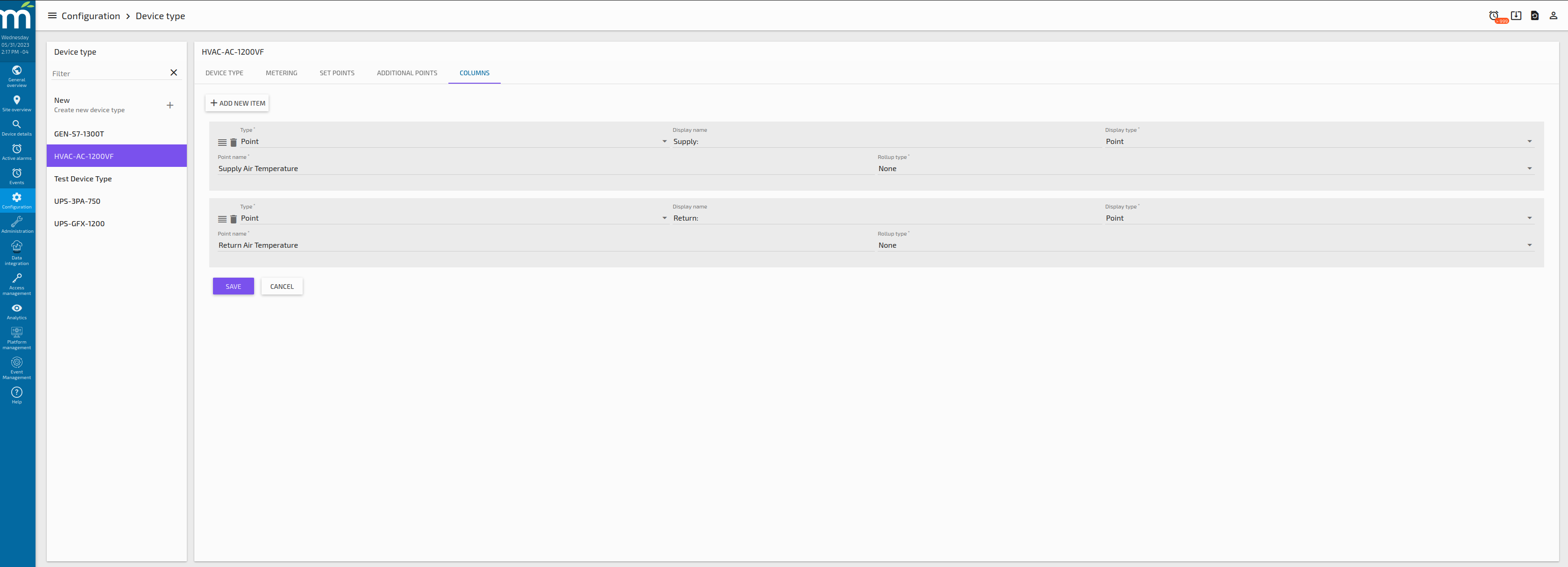
Multiple data points can be added to the same column, like is shown in the following image.
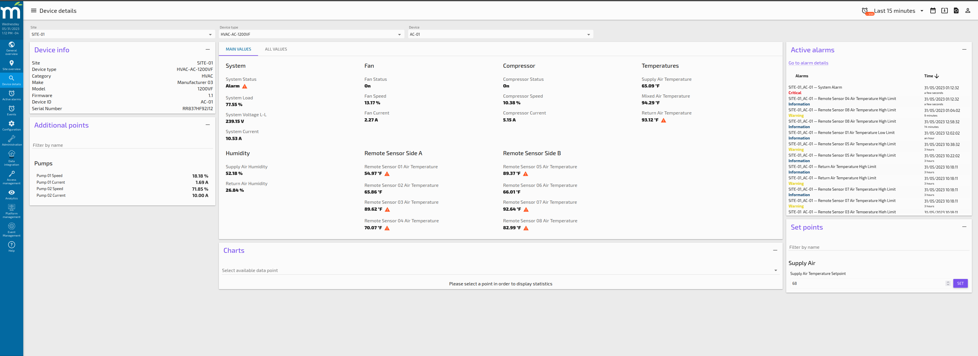
Device Details Page Example
The following image shows the result for the Device Type Configuration we have in our use case of the HVAC-AC-1200VF Device Type, where Metering, Setpoints and Additional Points are configured as well as the Active Alarms filtered for this particular device which is AC-01.